A multi-disciplinary 3rd-grade Project-Based Learning unit. Students research extreme weather, analyze historical weather data to create bar graphs, design and write hazard-prevention plans, and present their engineered towns.
Class Activity: Fill in the interactive blanks together! WEATHER-READY TOWN PBL
Math Anchor Chart
Data & Graphing Wizards!
PBL Analytics
How do we graph risk?
The Math Mission: Historical weather data shows us how often extreme storms occurred in the past. To understand this clearly, we represent raw numbers visually using a Scaled Bar Graph!
The 4 Parts of an Awesome Scaled Bar Graph:
1
Descriptive Title
Tells exactly what data we are studying. It must include the location and years. Example: "Extreme Weather Events in Safehaven (1975–2025)"
2
Labeled Axes (X and Y)
Y-Axis (Vertical Line): Labels the counts or frequencies (e.g., "Number of Storms"). X-Axis (Horizontal Line): Labels the categories of hazards (e.g., "Blizzards", "Hurricanes").
3
Scaled Intervals (Choosing the Scale)
Instead of counting by 1s (which takes too long!), we count by intervals of 2, 5, or 10.
If your highest data point is 15: Count by 2s or 5s! If your highest data point is 50: Count by 5s or 10s!
4
Accurate Bars
The top of each bar must align exactly with the numerical frequency values from your data table. Interactive Check: If a storm happened 15 times, and our scale counts by 5s, how high is the bar? ____ blocks.
Graph Detective Checklist
Title includes Location & Years
Y-Axis counts by equal intervals
X-Axis lists all storm hazards
Bars are neat and spaced evenly
Keep these charts visible on the wall for the entire 10-day unit! WEATHER-READY TOWN PBL
Engineered Structure 2 (e.g. Slanted Roof, Rod):
WEATHER-READY TOWN PBL • STUDENT PACKET Page 2 of 4
Phase 2: Math Data Station
Historic Regional Analysis
Engineer: __________________
Town A: Shoreline Bay Coastal
🌊 Coastal Floods: 35 events
🌪️ Tornadoes: 10 events
❄️ Blizzards: 0 events
⚡ Severe Storms: 15 events
Town B: Stormy Peaks Mountainous
🌊 Coastal Floods: 0 events
🌪️ Tornadoes: 5 events
❄️ Blizzards: 40 events
⚡ Severe Storms: 20 events
Town C: Windy Plains Flat Grasslands
🌊 Coastal Floods: 5 events
🌪️ Tornadoes: 45 events
❄️ Blizzards: 10 events
⚡ Severe Storms: 20 events
Draw Your Team's Scaled Bar Graph
Use a scale of 5!
50454035302520151050
Coastal Floods Tornadoes Blizzards Severe Storms
Data Investigation Questions
Based on your graph, which weather hazard occurs most frequently in your chosen town?
How many total events occurred over the 50-year period across all categories in your town? Show your work.
WEATHER-READY TOWN PBL • STUDENT PACKET Page 3 of 4
Phase 3: Design & Write
Town Map & Proposal Blueprint
Engineer: __________________
Our Weather-Ready Town Map Layout:
Map Key Guidelines:
Draw the following hubs on your grid:
H Hospital (Emergency Hub)
W Water Station (Reservoir)
R Residential Zone (Homes)
Then draw your engineered defenses in blue ink:
Seawall / Levee Line
▲ Lightning Ground Rods
Wind Protection Dome
Written Safety Proposal Proposal
W.3.2 Informational Draft
Explain why your design is safe. State your Town Name, cite your math graph frequency counts, and describe the role of your engineered structures.
Our claim: Our town,
is extremely weather-ready because
According to our regional weather graph, our highest threat is
which occurred
times in 50 years. To solve this, we engineered
These structures will protect our citizens by
WEATHER-READY TOWN PBL • STUDENT PACKET Page 4 of 4
🔍 Math Skill Focus: Scale Selection In 3rd grade, scaled bar graphs make large numbers easy to read. Instead of counting by 1s (0, 1, 2, 3...), we can count by intervals like 2s, 5s, or 10s. Read the prompts below to practice picking the best scale!
Scenario Alpha:
The highest number of storms is 14. If your graph paper has only 10 rows, which scale works best?
Scale of 1 (Highest line is 10)
Scale of 2 (Highest line is 20)
Scale of 10 (Highest line is 100)
Explain why you chose this scale:
Scenario Beta:
The highest number of storms is 45. If your graph paper has only 10 rows, which scale works best?
Scale of 2 (Highest line is 20)
Scale of 5 (Highest line is 50)
Scale of 10 (Highest line is 100)
Explain why you chose this scale:
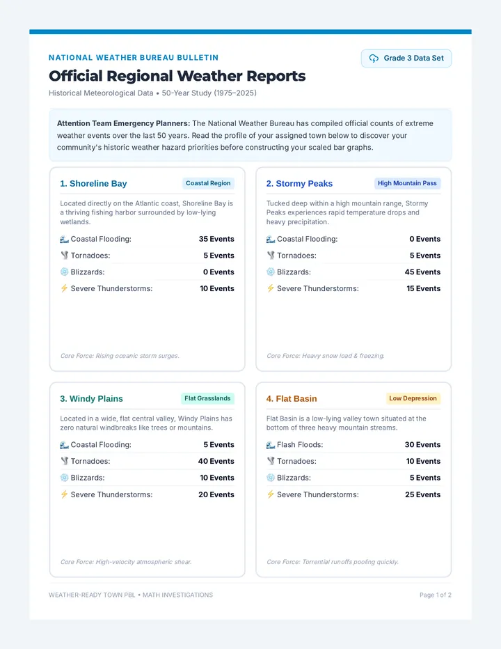
Analyze Your Assigned Town Data
Consult the briefings on Page 1 to solve these analytical math questions.
1. Town Risk Comparison Question:
Select any two towns. Find the difference in the number of Severe Thunderstorms that occurred between them. Show your work clearly.
Write equation & solve here:
Final Difference:
2. Combined Regional Hazard Question:
If Town A (Shoreline Bay) and Town B (Stormy Peaks) merged together into one big mountain-coastal city, how many combined Blizzards and Coastal Flooding events would they face together? Show your work.
Write equation & solve here:
Total Combined Events:
WEATHER-READY TOWN PBL • MATH INVESTIGATIONS Page 2 of 2
"Our design proves that smart mapping keeps essential services running during a major weather event."
Presenters: Hold up your team blueprint map and point to the key hubs!
Slide 4 of 5
PBL Showcase Prep
Presentation Success Blueprint
Speaking Excellence Checklist
✔
Voice Projection: Speak clearly and loudly like a radio dispatcher.
✔
Eye Contact: Look up from notes and make contact with your audience.
✔
Visual Pointers: Physically point to your graph and town blueprint.
Handling Q&A Sessions
How to transition to audience questions at the end:
"Thank you for listening to our proposal. What questions do the Town Council members have about our designs?"
When answering a question:
"Our science evidence shows that..." or "Our math graph proves that..."
Practice with your team members at least twice before the final showcase day!