Masking Mastery Teacher Guide Master of Masks
Lesson 1: Layering, Masking, and Compositing
Teacher Guide
Learning Objectives
Understand the concept of non-destructive editing .
Distinguish between erasing and masking .
Identify the relationship between resolution and composite quality.
Create a surrealist animal hybrid using layer masks.
The "Hook"
"Today, we aren't just photographers; we are digital surgeons. We will take the DNA of two different animals and merge them into a single, seamless creature that looks like it belongs in a nature documentary."
Instructional Flow
1
Introduction to Layers (10 min)
Explain the concept of "Digital Acetate." Use the analogy of stacking clear sheets of plastic. Introduce the layers panel in your chosen software (Photoshop, Photopea, etc.).
2
The Power of the Mask (15 min)
Demonstrate why we never use the Eraser tool. Show that White = Reveals and Black = Conceals. Demo a basic blend between a texture and a shape.
3
Hybrid Animal Workshop (30 min)
Students follow the Chimera Creator Worksheet . They must find two high-resolution images (Creative Commons) and blend them.
Teacher Tip: Watch for students selecting low-res, pixelated images—this is the #1 reason composites look "fake".
Common Roadblocks
"I'm painting black, but nothing is disappearing!"
Check: Is the Layer Mask selected (look for the white border around the mask icon), or are they painting on the actual image layer?
Edge Management
Encourage students to use a "Soft Round Brush" (low hardness) to create natural transitions between animal parts.
Masking Mastery Slides Pixel & Path: Lesson 1
Master of Masks
How to build a digital chimera.
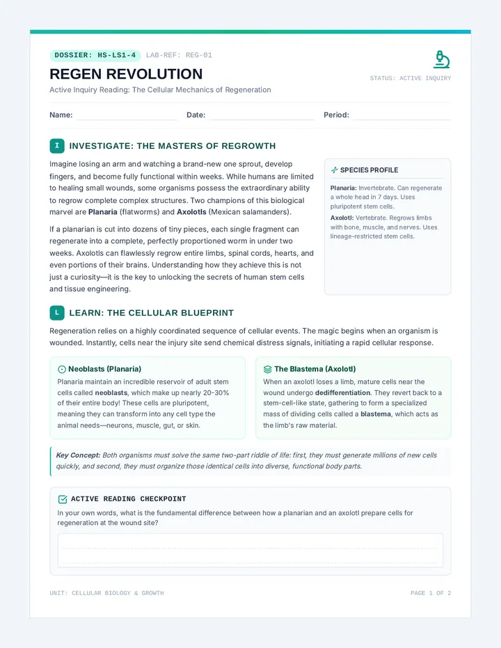
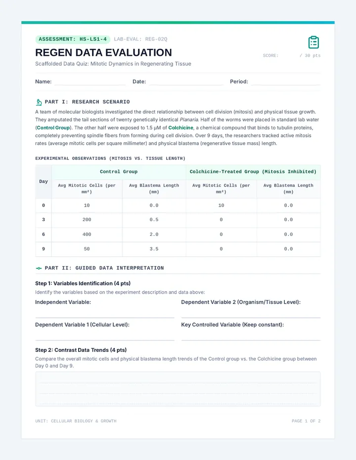
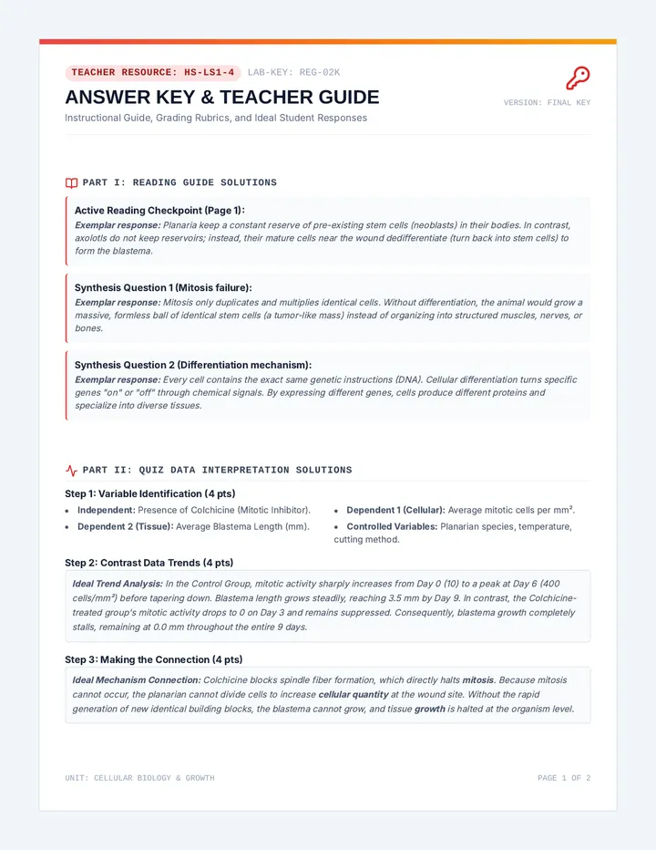
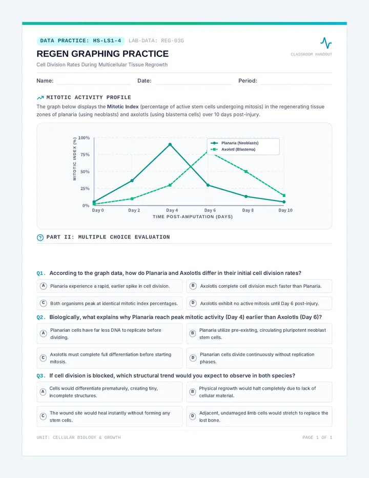
The Design Shield
Non-Destructive Editing
Professional designers never delete pixels. If you delete them, they are gone forever.
"Masking is like a invisibility cloak. The pixels are still there; we just choose not to see them."
The Eraser Tool
Permanent destruction. Very risky.
Layer Masks
Flexible and reversible. The pro way.
The Golden Rule
WHITE
Reveals
BLACK
Conceals
Think of the mask as a stencil. Paint with white to see the image, paint with black to hide it. Use shades of gray for transparency!
Resolution Check
Low Res
Pixelated
Small file size
Blurry edges
Looks "fake" in composites
High Res
3000 x 2000 px
Crisp details
Smooth blending
Essential for professional UI
Chimera Creator Worksheet Digital Bio-Lab Project
Chimera Creator
Name: ______________________
Date: __________
Mission Protocol
Your goal is to blend two distinct animals into a single, seamless creature. You must use layer masks to create the transition. No erasers allowed! Your creature should look physically possible.
Step 1: The Blueprint
Animal A (The Body):
Example: African Elephant
Animal B (The Head/Wings):
Example: Great Horned Owl
Sketch your concept here (roughly)
Where will the "mask" be most complex?
Step 2: Technical Execution
High-Res Check
Ensure both images are at least 2000px on the longest side.
Mask Hygiene
Only use Black and White on your mask layer. Use a soft brush for skin/fur.
Blending Modes
Adjust Opacity or Levels so the lighting matches on both animals.
Debrief Notes
Explain one specific area where you used a partial (gray) mask to blend fur or feathers:
If you were forced to use the Eraser tool, why would this project be harder to finish?
Retouching Reality Slides Pixel & Path: Lesson 2
Perfectly Real
Restoration, correction, and the truth about pixels.
The Healer's Kit
Healing Brush
Fixes small spots and blemishes by blending surrounding textures automatically.
Clone Stamp
Exact pixel copying. Best for complex patterns or missing chunks of an image.
Levels & Curves
Correction for "washed out" or "too dark" photos. Balances light and shadow.
The Ethics of Pixels
When is it okay?
Restoring a family photo from 1950, color correcting a dark wedding photo, removing a trash can from a landscape.
When is it crossing the line?
Changing a model's body shape, altering a news photo to change a story, making a product look "fake" better.
The Golden Question
"Does this edit mislead the viewer in a harmful way?"
Spot the Lie
We're about to see a magazine cover. In your groups, find at least 5 things that look "too perfect" to be real.
Skin Texture
Shadows & Light
Body Proportions
Eye/Hair Color
Ethics Engine Teacher Guide Perfectly Real
Lesson 2: Digital Retouching and Ethics
Teacher Guide
Learning Objectives
Apply Healing Brush and Clone Stamp tools effectively.
Correct lighting and color balance using Levels/Curves .
Analyze the ethical impact of photo manipulation in media.
Restore a damaged image while maintaining historical/visual truth.
Ethics Discussion Guide
"Is a photo a window into reality or a piece of art? If we remove a scar from a portrait, are we helping the person or lying about them?"
Instructional Flow
1
Hook: Spot the Lie (15 min)
Show a high-fashion magazine cover alongside the raw photo (search for "Celebrity Retouching Before and After" for examples).
Prompt: "List 5 changes. Why did the designer make these changes? Who does this help? Who does it hurt?"
2
The Healer's Demo (20 min)
Demonstrate the difference between the Spot Healing Brush (AI-based) and the Clone Stamp (Manual). Show how to sample an area with Alt/Option + Click.
3
Restoration Challenge (40 min)
Provide students with a "Damaged Photo" (old photo with cracks or dust). They must use the Restoration Roadmap Worksheet to track their process.
Goal: Make it look like the photo was never damaged, but don't change the person's identity.
Critical Thinking Prompts
Social Media Filters
Are TikTok/Instagram filters "digital design" or a form of social pressure? How do they change how we see ourselves?
Historical Accuracy
If we "fix" a photo of a famous historical event to make it clearer, are we damaging history?
Restoration Roadmap Worksheet Image Restoration Protocol
Restoration Roadmap
Name: ______________________
Date: __________
Phase 1: Image Diagnosis
Open your assigned "damaged" photo. Before you click a single tool, analyze what needs to be fixed.
Identify Damage Types
Dust/Scratches
Faded Colors
Rips/Missing Paper
Poor Contrast
Priority #1:
Phase 2: Execution Log
Tool Used What did you fix? Difficulty (1-5) Healing Brush Clone Stamp Levels/Curves
The Ethics Reflection
Did your restoration change anything about the original subject's appearance that wasn't caused by damage? Explain why or why not.
In your opinion, is it ethical for a clothing brand to use these same tools to remove a model's freckles or wrinkles? Justify your stance.
Visual Flow Slides Pixel & Path: Lesson 3
Visual Hierarchy
Controlling where the eye goes first.
Eye Tracking
F-Pattern & Z-Pattern
Users don't read every word. They scan.
F
Common for text-heavy pages (blogs, news).
Z
Common for landing pages (headers, heroes).
Heat Map Mockup
The Hierarchy Pillars
Size
Bigger = More Important. Period.
Color
Contrast grabs attention (High Contrast = Priority).
White Space
Breathing room makes content stand out.
Typography
Bold vs Light weights guide the story.
Which Wins?
We're going to compare two website layouts. One follows a clear grid, one doesn't. Your task is to find the "Call to Action" in less than 2 seconds.
CHAOS
GRID SYSTEM
Grid Ghost Teacher Guide Hierarchy Hunt
Lesson 3: Layout Grids and Visual Flow
Teacher Guide
Learning Objectives
Identify F-Pattern and Z-Pattern scanning behaviors.
Manipulate size, color, and weight to create a hierarchy.
Understand the role of grid systems in alignment and professional design.
Analyze eye-tracking data (heat maps) to evaluate UI effectiveness.
The "Eye Test"
"Design is not just what it looks like. Design is how you guide a user through a story without them even knowing you're doing it."
Instructional Flow
1
Heat Map Inquiry (15 min)
Show an eye-tracking heat map of a Google search page vs. an Instagram feed.
Question: "Where is the 'hottest' part of the page? Why do you think Google puts the most important info there?"
2
The 4 Pillars Mini-Project (20 min)
Give students a plain text block (e.g., a movie poster's info). Have them use a design tool to make one element dominant using ONLY Size , then ONLY Color , then ONLY Space .
3
Layout Logic Lab (45 min)
Students use the Layout Logic Worksheet to deconstruct a landing page into a grid. They then re-design it to change the user's priority (e.g., make them look at the 'Sign Up' button instead of the 'Logo').
The Hidden Grid
Alignment is Everything
If one box is 2 pixels off, the human brain notices "messiness" even if it can't explain why. Teach students to use "Snap to Grid" features.
The "Squint Test"
Tell students to squint their eyes until the screen is blurry. The biggest, brightest shapes that remain are your Level 1 Hierarchy. If they aren't the right things, the design failed.
Layout Logic Worksheet Composition & Flow Lab
Layout Logic
Name: ______________________
Date: __________
Part 1: The Grid Ghost
Draw the grid lines of the website on your screen. Where are the columns?
Analyze the Scanning Pattern:
Does this page follow an F-Pattern or a Z-Pattern? Why?
Identify the Pillars:
Size:
Color:
Weight:
Part 2: The Squint Test Redesign
Sketch New Hero Layout Here
Challenge:
Redesign the layout above so that the "Buy Now" button is the #1 thing people see. Use high-contrast color and extra white space to make it pop.
Reflection:
How did your use of alignment make this design feel more "official" or professional?
Blueprint Basics Slides Pixel & Path: Lesson 4
Blueprint Logic
Function before form. UX before UI.
UX vs UI
UX
User Experience
"How does it work? Is it easy? Can I find what I need?"
User Flows
Logic & Efficiency
Wireframes
UI
User Interface
"How does it look? Is it pretty? Do the colors match?"
Typography & Color
Buttons & Icons
High-Fi Mockups
Logic first. Style later.
Wireframing Language
X
Image
Text Body
BUTTON
Interactive
Profile
Broken Logic
If a user has to click 10 times to buy a pizza, they will close the app. Our goal is the "Happy Path"—the shortest, easiest route to success.
Home
Search
Checkout
Success!
UX Umpire Teacher Guide UX Umpire
Lesson 4: Wireframing and User Experience
Teacher Guide
Learning Objectives
Differentiate between User Experience (UX) and User Interface (UI) .
Map a User Flow from start to completion.
Use standard wireframing symbols to represent digital elements.
Conduct a paper prototype test to identify usability issues.
The "Happy Path"
"Every app is a maze. If you make the walls too high or the paths too long, the user gives up. We are designing the easiest way out."
Instructional Flow
1
Hook: The Frustration Test (15 min)
Hand students a paper "app" with buttons that lead to dead ends.
Prompt: "Order a pizza using this app. Oh wait, the 'Next' button doesn't exist. How does that feel?" Discuss why "friction" kills apps.
2
UX Architecture (20 min)
Explain User Flows . Use the white board to map out the steps to upload a photo to Instagram.
Key Rule: No colors or fonts allowed in this phase. Black and white lines only.
3
App Architecting (45 min)
Students follow the App Architect Worksheet . They choose a simple app idea (Recipe Book, Habit Tracker, Music Player) and wireframe 3 key screens.
UX Red Flags
Dead Ends
Every screen must have a way to go "Back" or "Home".
Hidden Buttons
Buttons must look like buttons. If it's clickable, it needs a box or border.
Information Overload
If there are 20 buttons on one screen, the user will be paralyzed. Simplify!
App Architect Worksheet App Structural Planning
App Architect
Name: ______________________
Date: __________
Step 1: The Vision
App Name:
Core Goal:
"Help users [ACTION] in [TIME/STEPS]"
Step 2: The User Flow
Map out the 4 steps to complete the app's main task (The Happy Path).
Splash
Goal Reached
Step 3: Low-Fidelity Wireframes
Home Screen
Feature Screen
Action/Success
Wireframe Checklist:
Did you use the with an X for images?
Does every screen have a "Back" button?
Are your buttons clearly labeled?
Is the content aligned to a grid?
Interface Icon Slides Pixel & Path: Lesson 5
Pixel Polished
From skeleton to surface. High-fidelity design.
The Skinning Phase
Bringing it to Life
We are adding the visual polish to your logical blueprint.
Palette
Typography
Interactions
Components
Visual Consistency
Corner Radius
Pick one: Sharp, Rounded, or Pill? Use it everywhere.
Color Language
ACTION
DISABLED
ERROR
SUCCESS
Colors must have meanings. Don't use 50 shades of blue.
Icon Styles
Match the line weight of your icons. Keep the style unified.
Launch Day
We are turning our classroom into an App Gallery. You will present your high-fi mockup and receive feedback on two categories: Clarity and Style .
Clarity
"Can I tell what this app does in 3 seconds?"
Style
"Do the colors and fonts match the app's 'vibe'?"
Critique Captain Teacher Guide Critique Captain
Lesson 5: High-Fi UI Design & Critique
Teacher Guide
Learning Objectives
Apply color theory and typography to wireframes.
Maintain visual consistency across multiple screens.
Participate in a constructive peer critique (Gallery Walk).
Iterate on a design based on usability feedback .
Final Showcase Hook
"Today, you aren't students—you're a startup pitching to investors. Your designs need to look polished enough to download from the App Store right now."
Instructional Flow
1
The Design System (20 min)
Explain why big brands (Google, Apple) have "Human Interface Guidelines."
Demo: Show how to create a "Symbol" or "Component" for a button so that changing one changes them all.
2
Deep Work: High-Fi Mockup (60 min)
Students use the Design Deck Worksheet as a reference while they stylize their wireframes.
Check for: Text contrast (no yellow text on white), icon sizing, and image quality.
3
Gallery Walk Critique (30 min)
Use "Post-it Critique." Students walk around and leave one Warm comment (what works) and one Cool suggestion (how to improve usability).
The Final Rubric
Hierarchy
Consistency
UX Flow
Visual Polish
Is the most important button obvious?
Are corners, fonts, and colors unified?
Can a user reach the goal without friction?
Are images high-res and icons well-aligned?
Design Deck Worksheet UI Style Guide & Final Spec
Design Deck
Name: ______________________
Date: __________
Part 1: The Visual Language
Typography
Heading Font:
Body Font:
Color Palette
#HEX
#HEX
#HEX
Describe your "Primary Action" color and why you chose it:
Button Style
Sharp
Rounded
Pill
Does your button use a Drop Shadow ?
Yes / No
Part 2: The Gallery Walk
Warm Feedback
"I really like how you handled the [ELEMENT] because it makes the app feel [EMOTION]."
Cool Feedback
"One area where I got confused was [LOCATION] because [REASON]. Maybe try [SOLUTION]?"
Sequence Reflection
Looking back at the whole sequence—from masking animal hybrids to building a mobile app—what is the most important thing you learned about how visual design influences human behavior ?