Layout Language Slides Vibe Coding Studio
LAYOUT LANGUAGE
Mastering the vocabulary of web design to speak fluent AI.
Lesson 01
The Telephone Challenge
"If you had to describe your favorite website over the phone to a blind artist, could they draw it?"
Think about it:
Where is the logo?
How many columns are there?
What happens at the very bottom?
Anatomy of a Interface
HERO SECTION
The "Billboard" of your site. Huge text, big image, main button.
SIDEBAR
Navigation or extra tools on the left/right.
MAIN FEED
Where the primary info lives (Grid or List).
FOOTER
The Structure Wars
FLEXBOX
"The Row/Column Logic"
Best for lining things up in a single direction. Think of a navigation bar or a row of buttons.
GRID
"The Map Logic"
Best for complex 2D layouts. Think of a photo gallery or a dashboard with different sized boxes.
From Sketch to Prompt
Wireframe Sketch
"A rough drawing showing the structure."
PROMPT:
"Create a three-column grid layout. Put a hero section at the top with a centered CTA button. Include a fixed sidebar on the left for navigation."
AI Code Generation Begins...
MISSION START
You will sketch a layout, then translate it into a prompt using your new vocabulary.
1. SKETCH
2. PROMPT
3. GENERATE
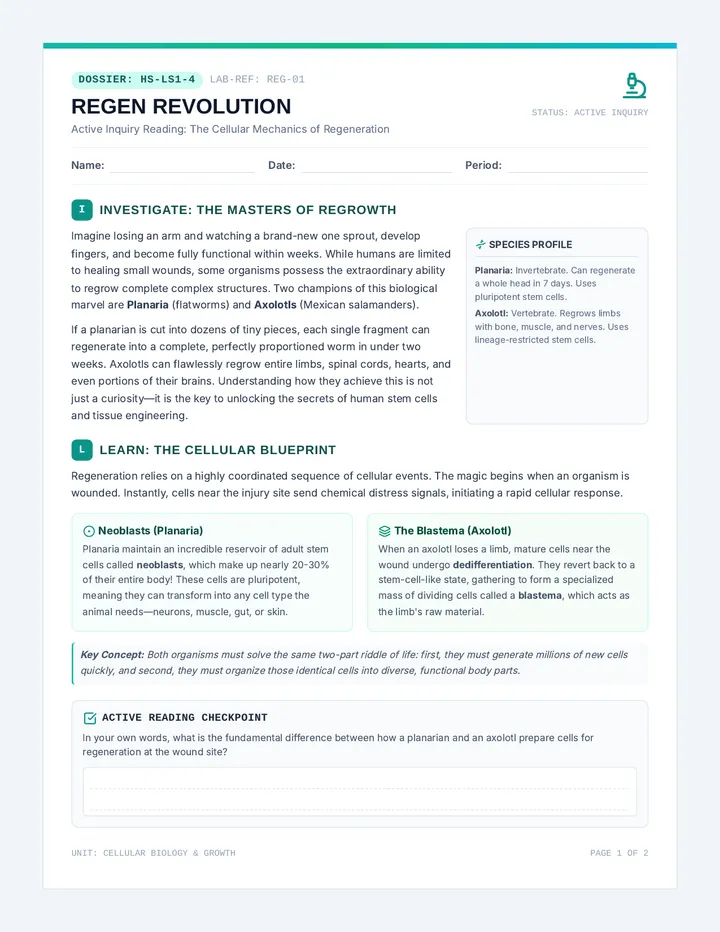
Wireframe Translator Worksheet WIREFRAME TRANSLATOR
Lesson 01: Layout Language
Name:
Date:
PART 1
Visual Vocabulary Match
Draw a quick line from the term to its correct visual description.
Hero Section
Sidebar
Grid Layout
CTA Button
A narrow vertical area on the edge for tools/links.
The "Call to Action" that tells the user what to do.
The massive top area that catches attention immediately.
Content organized in rows and columns like a mosaic.
PART 2
Wireframe Sketch
In the box below, sketch a rough wireframe for a **Food Delivery App**. Use simple rectangles to show where things go.
PART 3
AI Prompt Translation
Now, translate your sketch into a written prompt for an AI. Use at least **four** of the vocabulary words from Part 1.
Your Prompt:
Tip: Be specific about spatial relationships! Use phrases like "aligned to the left," "centered horizontally," or "underneath the hero section."
Design Dictionary Guide DESIGN DICTIONARY
Teacher Reference Guide • Lesson 01
Ref: VC-01-TG
Teaching the "Vibe"
The goal of this lesson isn't to teach students how to code, but how to **describe**. AI models are highly sensitive to layout terminology. When students use "vague" words (like "put it on top"), the results are unpredictable. When they use "domain" words (like "Hero Section"), they leverage the AI's training on millions of web pages.
Key Layout Terms
Hero Section Essential
The first thing a user sees. High-impact, visual, and contains the "Primary Action."
"Create a full-width hero section with a dark overlay and a center-aligned H1."
Fixed Sidebar Structural
A navigation bar that stays in place while the content scrolls. Common in dashboards.
"Add a fixed sidebar on the left with icons for Home, Profile, and Settings."
Responsive Grid Advanced
A layout that changes the number of columns based on screen size (desktop vs mobile).
"Display the product list in a responsive 3-column grid that drops to 1-column on mobile."
Whitespace (Padding) Aesthetic
The empty space between elements. This prevents the design from feeling "claustrophobic."
"Increase the padding around the cards and add generous whitespace between sections."
Discussion Questions
Q1
Why do professional designers use these specific words instead of just saying "the top part" or "the side part"?
Q2
If you prompt an AI for a "modern layout" without layout terms, what do you think it defaults to? Why might that be boring?
Q3
How does knowing these terms change the way you look at your favorite apps like Instagram or Roblox?
Common Misconception
Students often think "Wireframing" needs to include colors and images. Remind them that wireframes are just the **bones**. Adding too much detail early can actually confuse the AI's layout logic. Focus on **placement** and **purpose** first.
Vibe Shift Slides Vibe Coding Studio
THE VIBE SHIFT
One code base. Infinite universes.
Lesson 02
The Instant Architect
In the time it takes to write one line of CSS...
...we're going to generate three completely different universes for your app.
Variation Archetypes
MINIMALIST
"Boring is beautiful." Lots of whitespace, thin fonts, muted grays.
"Clean, spacious, high-end, brutalist simplicity."
PLAYFUL
"Friendly & Fun." Rounded corners, bright colors, bubbly fonts.
"Bouncy, vibrant, squishy UI, neon gradients."
CORPORATE
"Professional & Trustworthy." Sharp edges, deep blues, formal structure.
"Rigid, reliable, data-heavy, executive aesthetic."
Adjectives = The New Syntax
01
Traditional Way
border-radius: 20px; background: #FF00FF;
02
Vibe Coding Way
"Make the buttons feel squishy and use a 90s arcade color palette."
"The AI translates the feeling into the CSS for you."
Vibe Swap
You'll start with one basic wireframe. Then, you'll prompt the AI to transform it three times using your Vibe Cards.
Base App
Minimalist
Playful
Retro
Cyberpunk
The Multi-Verse Interface Challenge Activity MULTI-VERSE INTERFACES
Lesson 02: Rapid Prototyping Variations
Designer:
Date:
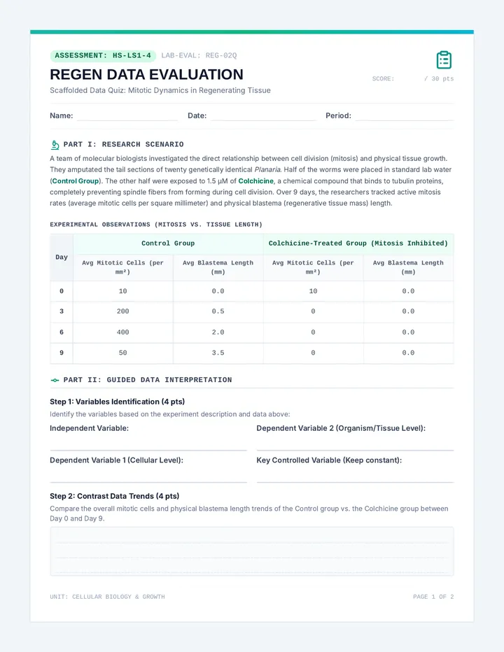
The Mission: One App, Three Universes
You are designing a **Music Player App**. Your wireframe is fixed: Hero Image, Song List, and Bottom Playback Bar. Now, use the power of the "Vibe" to transform it into three distinct versions.
1
UNIVERSE: THE MINIMALIST
Your Vibe Keywords:
High-End Monochrome Spacious
What to prompt the AI:
Write your specific vibe-shift prompt here...
2
UNIVERSE: THE PLAYFUL
Your Vibe Keywords:
Bubbles Gradients Bouncy
What to prompt the AI:
Write your specific vibe-shift prompt here...
3
UNIVERSE: YOUR CHOICE
Invent Your Vibe Keywords:
Think: Cyberpunk, Retro-80s, Forest Nature, Space Explorer, etc.
What to prompt the AI:
Write your specific vibe-shift prompt here...
Post-Shift Analysis
1. Which vibe felt the most "usable" and why?
2. How did the code change? (Did the AI add different colors, fonts, or shapes?)
Variation Prompt Bank Guide PROMPT BANK
Teacher Reference • Lesson 02 Archetypes
Variations Guide
Why Variation Matters
Vibe coding is about **Exploration**. Traditional coding encourages getting it "right" once. Vibe coding encourages generating 10 variations to find the "soul" of the product. Use this bank to help students who get stuck with "generic" prompts.
Cyberpunk
Dark, neon, high-contrast, edgy.
"Give this UI a Cyberpunk 2077 vibe. Dark background, neon pink and electric blue accents, glowing borders, and futuristic monospace fonts. Make it look like a hacker terminal."
Retro 8-Bit
Pixelated, nostalgic, bright primary colors.
"Transform this into a vintage 8-bit video game interface. Use blocky fonts, thick black borders around everything, and a limited palette of primary red, yellow, and blue. Everything should feel pixelated."
Glassmorphism
Modern, transparent, blurry, elegant.
"Make the UI feel like it's made of frosted glass. Use semi-transparent backgrounds with a heavy blur, subtle white borders, and soft colorful gradients in the background to show through the elements."
Nature / Zen
Calming, organic, earthy, soft.
"Apply a Zen Nature vibe. Use soft sage greens, sandy beiges, and organic rounded shapes. Avoid sharp corners. Use a serif font that feels elegant and calming. Lots of whitespace."
Implementation Tips
The "Refine" Step: If the first result is 80% there, tell students to prompt: "I like this, but make the colors slightly darker" rather than starting over.
Vocabulary Reinforcement: Remind them to combine Lesson 1 terms with Lesson 2 vibes: "Make the **hero section** feel like a **neon arcade**."
The Emoji Cheat: AI models often respond well to emojis in prompts for vibes. Example: "Make it look like 🎮🕹️👾" or "Make it feel like 🌿🧘☁️".
Design for All Slides Vibe Coding Studio
DESIGN
FOR ALL
Vibe coding isn't just about looks—it's about making sure your 'vibe' includes everyone.
Lesson 03
The Invisible Barrier
"Your app looks cool...
but can it be used by someone who can't see the screen?"
THE BAD VIBE
Low contrast text, tiny buttons, confusing navigation that only works with a mouse.
THE GOOD VIBE
High contrast, keyboard friendly, screen-reader ready, and clear visual hierarchy.
The Accessibility Prompt Toolkit
Contrast
Making sure text is easy to read against the background.
"Improve contrast ratios for all text."
Interactivity
Can I use the app with just my keyboard (Tab key)?
"Add visible focus states for keyboard navigation."
Semantic Code
Using the right tags so screen readers understand the site.
"Use ARIA labels and semantic HTML for screen readers."
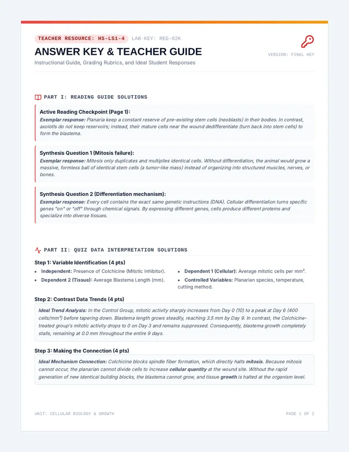
The "Fix It" Prompt
Broken UI
Pale yellow text on a light background. Hard to read. No focus outlines.
The Fix-It Prompt:
"Audit this code for WCAG accessibility. Darken the text for contrast, add 'alt' text for images, and make sure all buttons have a clear blue border when focused."
AI automatically rewrites the CSS and HTML.
THE AUDIT MISSION
1
Identify 3 accessibility issues in your current app.
2
Prompt the AI to fix them using "Design for All" terms.
3
Verify that the "Vibe" is still there, but better.
Accessibility Audit Lab Sheet ACCESSIBILITY AUDIT
Lesson 03: Designing for Everyone
Auditor:
Status:
IN PROGRESS
Phase 1
Identify the Barriers
Look at your current AI-generated prototype. Find three things that would make it hard for a person with a visual or physical impairment to use.
Barrier #1
(e.g., text contrast, button size)
Barrier #2
(e.g., missing labels, keyboard nav)
Barrier #3
(e.g., small touch targets)
Phase 2
The Fix-It Prompt
Write your AI Prompt below:
Goal: Fix the three barriers you identified while keeping the "Vibe" of your app. Use words like WCAG compliance , Semantic HTML , Contrast Ratio , and Focus States .
Before Fixing
Paste screenshot here or describe
After Fixing
Paste screenshot here or describe
Phase 3
Final Verification
Does the app still maintain its original "vibe"?
Yes
No
Which change made the biggest impact on readability?
Inclusive Design Standards Sheet Guide INCLUSIVE STANDARDS
Accessibility Cheat Sheet • Lesson 03
Ref: VC-03-STANDARDS
Why it matters
Accessibility isn't an "add-on." In professional software engineering, it's a legal and ethical requirement. Vibe coding allows students to bake these standards into their code instantly using natural language prompts.
The "Magic Word"
WCAG (Web Content Accessibility Guidelines) is the global standard. Prompting the AI to "Follow WCAG 2.1 Level AA standards" instantly applies dozens of best practices.
Feature Standard Vibe Coding Prompt Contrast Text must have a ratio of 4.5:1 against background. "Darken the text and background contrast for readability." Keyboard Nav Every button/link must be reachable with 'Tab'. "Make sure the whole UI is keyboard-navigable." Visual Focus A clear border/outline must appear when focused. "Add high-visibility focus states to all buttons." Alt Text Images must have descriptions for screen readers. "Add descriptive ARIA labels to all images." Touch Targets Buttons must be at least 44x44 pixels. "Increase the click area of all mobile buttons."
Facilitation Guide
The Blindfold Simulation
Ask a student to close their eyes while another student tries to guide them through the app's navigation using only words. This highlights where the flow breaks down.
Check the Code
Encourage students to look at the AI output. Do they see tags like <button> instead of <div>? That's the AI moving from "visual-only" to "semantic" code.
"Design is not just what it looks like and feels like. Design is how it works." — Steve Jobs
The Feel Factor Slides Vibe Coding Studio
THE FEEL FACTOR
Coding the emotion of a click.
Lesson 04
Satisfying Interaction
"What makes a button feel satisfying to click?"
Movement
Does it move when I touch it?
Feedback
Does it glow or change color?
Timing
Is it snappy or slow and smooth?
The Power of Micro-interactions
Small details contribute to the **Overall Experience**.
The Button Bounce
The Card Hover Elevation
The Loading Pulse
CLICK ME!
Prompting for the "Feel"
Describing Logic
"When I hover over a card, make it lift up and add a soft shadow."
Describing Emotion
"Make the checkout button feel super satisfying to click. It should squish slightly and then pop back."
The AI interprets these "feeling" words into CSS Keyframes and Transitions.
THE FEEL TEST
1. MAPPING
Pick 3 elements in your app that need more "life."
2. PROMPTING
Prompt the AI using "emotional" interaction words.
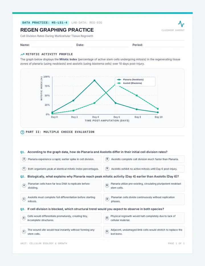
Micro-interaction Map Worksheet MICRO-INTERACTION MAP
Lesson 04: The Feel Factor
Interaction Designer:
App Name:
A Micro-interaction is a small functional detail that provides feedback. It tells the user "something happened." Today, you will map out how your app should react to the user.
Element
Trigger
The "Vibe" Reaction (How it feels)
Primary CTA Button
HOVER
e.g., "Glows with a soft neon pulse and expands slightly..."
Navigation Icon
CLICK
Content Card
HOVER
Choose Your Own:
PHASE 2
The Interaction Prompt
PROMPT CONSTRUCTOR:
Combine your reactions from the map into one descriptive "Vibe" prompt. Use emotional adjectives!
"Add micro-interactions to my app. When I hover over buttons, make them feel..."
PHASE 3
The Satisfying Check
Did any interaction feel "too much"? (e.g., too many flashes, too slow). How would you prompt the AI to dial it back?
"I'd tell the AI to make the animation more subtle by..."
Animation Cheat Sheet Guide ANIMATION CHEATSHEET
Micro-interaction Guide • Lesson 04
Ref: VC-04-ANIM
Prompting the Soul
In Vibe Coding, you don't need to know @keyframes or cubic-bezier curves. You just need to know how to describe the **physics** and **emotion** of the movement. Use these "Vibe Keywords" to help students refine their animations.
Snappy & Energetic
Vibe Keywords:
"Instant," "Popping," "Elastic," "Bouncy," "Jiggly," "Springy."
Example Prompt:
"Make the buttons pop out with an elastic bounce when hovered."
Smooth & Elegant
Vibe Keywords:
"Fading," "Gliding," "Soft," "Silky," "Subtle," "Ethereal."
Example Prompt:
"Add a soft, silky fade transition between pages."
Atmospheric
Vibe Keywords:
"Pulsing," "Glowing," "Drifting," "Shimmering," "Breathing."
Example Prompt:
"Give the hero text a subtle breathing pulse glow."
Warning / Alert
Vibe Keywords:
"Shaking," "Vibrating," "Flashing," "Abrupt," "Stutter."
Example Prompt:
"If the input is wrong, make the box shake like a vibrating phone."
Teacher Tip: The "Dial" Strategy
If a student's animation is too much, teach them to "dial it back" in their prompt.
"I love the bounce, but make it 50% more subtle and twice as fast."
AI models understand proportions and speed comparisons extremely well.
The Feedback Loop Slides Vibe Coding Studio
STUDIO CRITIQUE
The Final Iteration Loop.
Lesson 05
The Hard Truth
"Your user just said your app is
'Confusing.'"
In the old world, that meant weeks of redesign.
In the Vibe Coding world, how fast can you prompt a solution?
The Feedback Loop
DEPLOY
TEST
ITERATE
How to Give a Studio Critique
DON'T SAY:
"I don't like it."
"The colors are weird."
"It's boring."
DO SAY:
"I had trouble finding the main button."
"The vibe feels too formal for a music app."
"The animation is a bit too slow."
Good feedback gives the designer a Prompt Idea.
THE SWAP
Swap devices with a partner. Try to use their app for 2 minutes.
Write Feedback
Prompt Fixes
Final Polish
Studio Critique Workshop Activity STUDIO CRITIQUE
Lesson 05: User Testing Workshop
Designer:
User Tester:
Phase 1
User Experience (UX) Log
Tester: Use the app for 2 minutes. Answer honestly but kindly.
1. What was the first thing you noticed about the "vibe"? Does it match the app's purpose?
2. Was there any part of the layout that felt confusing or hard to find?
3. How did the animations feel? (Satisfying, too slow, distracting?)
Phase 2
Feedback Synthesis
Top 3 Feedback Points:
NEW ITERATION PROMPT:
Translate the feedback above into a specific prompt for the AI to fix the issues.
"Based on user feedback, I need to..."
Phase 3
Final Prototype Review
Paste or describe your final polished result!
UX Feedback Rubric Guide UX RUBRIC
Assessment Guide • Lesson 05 Final Project
Ref: VC-05-RUBRIC
Assessing the "Vibe"
How do you grade a "Vibe"? In this sequence, we grade the student's ability to **translate user needs into technical prompts**. The focus is on the iteration loop and the specificity of their design vocabulary.
Criterion Exceeding (4) Meeting (3) Developing (2-1) Prompt Specificity Uses professional design terms (Hero, Grid, Flex) and precise adjectives (snappy, brutalist). Uses basic design terms and clear adjectives to describe changes. Prompts are vague ("make it better," "change the colors") or overly simple. Iterative Growth Final version shows dramatic improvement based on partner feedback. Final version addresses most feedback points correctly. Little change between the first and final prototype. Accessibility App is high-contrast, keyboard-navigable, and has clear focus states. App has good contrast and basic keyboard support. Accessibility issues (low contrast, small buttons) remain in the final. The "Feel" Factor Interactions are highly satisfying and match the app's aesthetic perfectly. Includes clear micro-interactions like hover states and transitions. App feels "static" with little to no animation or feedback.
Observation Checklist
Student used at least 4 professional design terms in their final prompt.
Student correctly identified an accessibility barrier in a partner's work.
Student translated a vague "I don't like it" into a specific prompt fix.
Final prototype maintains a cohesive "vibe" throughout all sections.
"The goal of Vibe Coding is to move from 'How do I write this?' to 'What do I want to create?'"