Graph Safari Slides
Statistics Expedition
Introductory Stats Workshop
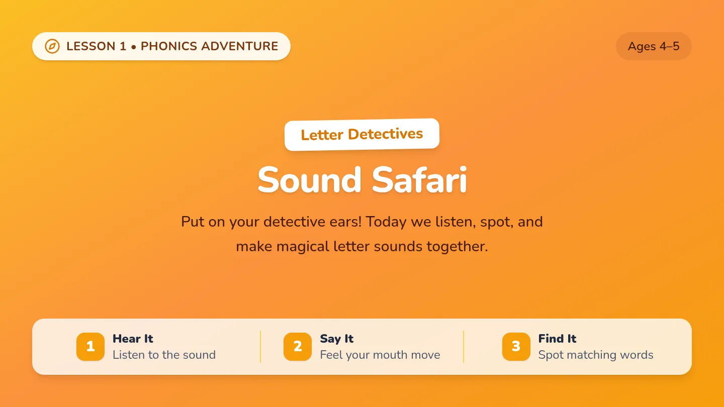
Graph Safari
Discover how visual stories bring numbers to life across four mission stages!
1. Warm-Up
Real-World Graphs
2. Core 4 Types
Bar, Line, Pie, Picto
3. Sorting Game
Match & Justify
4. Create Yours
Library / Moonflower
PART 1
Warm-Up: Where Do You See Graphs?
Real-World Data Sightings
Sports & Games
Player shot charts, team standings, win streaks, gaming leaderboards.
Weather Reports
7-day temperature forecasts, hourly rain probability, storm radar tracking.
Business & Tech
Quarterly product sales, app screen-time reports, monthly budgeting.
Health & Science
Daily step counters, sleep cycle monitors, heart rate workout zones.
Think-Pair-Share: What can we learn in 5 seconds from a graph that raw numbers can't show?
Patterns & Comparisons!
01
Bar Graph (Comparing Amounts)
Categorical Comparisons
Favorite Ice Cream Flavors (Class Survey)
16
8
0
14
Choc
10
Vanilla
6
Strawb
8
Mint
Distinct Flavor Categories (Spaces Between Bars!)
When to Use a Bar Graph:
- • Compares different categories or groups.
- • Height/length shows the exact amount or count.
- • Bars have spaces between them because categories are separate.
Quick Analysis: How many more students preferred Chocolate over Strawberry?
14 − 6 = 8 Students
02
Line Graph (Changes Over Time)
Tracking Continuous Trends
Temperature Changes Throughout a Week (°F)
80°
70°
60°
Mon Tue Wed Thu Fri Sat Sun
Days of the Week (Continuous Flow of Time)
When to Use a Line Graph:
- • Shows how something changes over time.
- • Points are connected by line segments.
- • Helps spot upward trends, drops, and cycles immediately!
Trend Question: Which day reached peak temperature, and what happened after?
Peak on Thursday (78°F) → Dropped
03
Pie Chart (Parts of a Whole)
100% or 24-Hour Proportions
24 Hours
Sleep (8 hrs • 33%)
School (7 hrs • 29%)
Fun / Hobby (4 hrs • 17%)
Sports (3 hrs • 13%)
Meals (2 hrs • 8%)
When to Use a Pie Chart:
- • Represents parts of a single whole (100%).
- • Each slice corresponds to its percentage share.
- • Best with 5-7 slices max (avoid clutter!).
Proportion Check: What combined fraction of the entire day is spent sleeping and in school?
15 hrs / 24 hrs (> 62%)
04
Pictograph (Symbols & Icons)
Visual Symbol Counts
School Supply Store: Items Sold This Week
Notebooks
📓 📓 📓 📓 📓
25
Pencils
✏️ ✏️ ✏️ ✏️ ✏️ ✏️ ✏️
35
Highlighters
🖍️ 🖍️ 🖍️ 🖍️
20
Backpacks
🎒 🎒
10
THE KEY (Legend): Each Symbol = 5 School Supplies Sold
When to Use a Pictograph:
- • Uses pictures or symbols to represent data.
- • MUST have a Key defining each icon's value.
- • Eye-catching and easy for the public to interpret!
Key Detective: If a new row has 3 ✏️ symbols, how many pencils were sold?
3 × 5 = 15 Pencils
PART 3
Group Challenge: Graph Sorting Game
Collaborative Match & Defend
Dataset Alpha Team Task
"Monthly rainfall in Moab measured continuously from January through December."
Best Graph Match: Line Graph
Dataset Beta Team Task
"Percentage breakdown of how a town festival spends its $10,000 total budget."
Best Graph Match: Pie Chart
Dataset Gamma Team Task
"Number of students choosing Soccer, Basketball, Track, or Volleyball."
Best Graph Match: Bar Graph
Dataset Delta Team Task
"Community garden tree planting counts where each 🌲 symbol represents 10 trees."
Best Graph Match: Pictograph
Work in your table groups: Match your cards, record on your worksheet, and prepare your 10-second justification!
PART 4
Create Your Own Graph!
Library & Moonflower Data Lab
Your Studio Mission
Bring your real field observations to life!
Use the data you collected from the Library or Moonflower and construct a complete graph showing what you discovered!
📚 Library Data Ideas:
Genres checked out, visitor traffic by hour, study table occupancy.
🌻 Moonflower Ideas:
Produce item sales, customer payment methods, shopper counts by aisle.
Must-Have Graph Elements:
- ✓ Clear Descriptive Title
- ✓ Labeled Axes or Legend / Key
- ✓ Consistent & Accurate Scale
- ✓ 1-Sentence Takeaway: What did you learn?
Turn to Page 2 of your Graph Safari Worksheet to craft your graph and conclusion!
Graph Safari Worksheet
Stats Field Expedition Visualizing Data 101
Graph Safari: Field Guide & Lab
Name:
Date: Period:
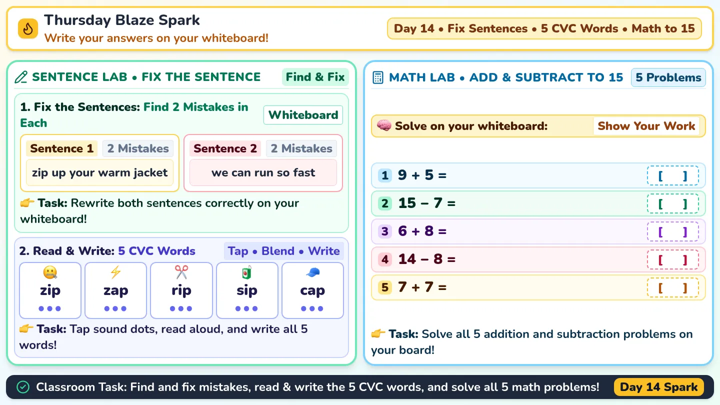
Part 1: Warm-Up Activity — Graphs in Real Life
Think-Pair-Share
1. Where have you seen graphs in real life? (List 2–3 places):
2. What kind of information can we learn from graphs quickly?
Part 2: The Core Four Graph Types — Field Notes
Record definitions & analysis
1
Bar Graph • Comparing Amounts
Example: Favorite Ice Cream Flavors
Best Used For: Comparing separate categories or groups. Heights show counts.
Why do the bars have spaces between them?
Choc
Van
Straw
Mint
2
Line Graph • Changes Over Time
Example: Weekly Temperatures
Best Used For: Showing continuous trends or changes over hours, days, or years.
Why does connecting points with line segments make sense here?
MTWTF
3
Pie Chart • Parts of a Whole
Example: 24 Hours in a Day
Best Used For: Showing percentages or proportions that add up to 100% (or 24 hrs).
What MUST all slices of a pie chart total up to?
• Sleep (33%)
• School (29%)
• Other (38%)
4
Pictograph • Images or Symbols
Example: School Supplies Sold
Best Used For: Visual symbol counts. Easy to read quickly for general audiences.
Why is a KEY or LEGEND required on every pictograph?
✏️ ✏️ ✏️ = 15
Key: ✏️ = 5 pencils
Page 1 of 2 • Flip Over for Group Game & Graph Studio →
Graph Safari: Group Sorting Game & Data Creation Lab
Page 2 of 2
3 Part 3: Group Activity — Graph Sorting Game
Team Collaboration
Match each dataset with the best graph type (Bar Graph, Line Graph, Pie Chart, Pictograph) and write a 1-sentence justification:
Dataset A: Monthly rainfall over a full year (Jan–Dec)
Graph:
Justification:
Dataset B: How a town festival spends its $10,000 budget
Graph:
Justification:
Dataset C: Number of students in 4 different afterschool sports
Graph:
Justification:
Graph Safari Answer Key
Teacher Guide & Key Visualizing Data 101
Graph Safari: Facilitation Guide & Answer Key
Official Master Key
Part 1: Warm-Up Activity Solutions & Facilitation
Discussion Guide
1. Where have you seen graphs in real life?
• Acceptable Student Answers: Sports stats/leaderboards, 7-day weather apps, iPhone screen-time reports, fitness step trackers, stock market news, election results.
2. What kind of info do we learn quickly?
• Core Concept: Highs and lows, overall upward/downward trends, comparisons between groups, and proportions without needing to calculate raw numbers.
Part 2: The Core Four Graph Types — Solutions & Misconceptions
1. Bar Graph • Ice Cream Example
Categorical
Why do the bars have spaces between them?
• Solution: The data is categorical. Flavors are independent, separate categories with no numerical continuum between them.
Teacher Note: Clarify that histogram bars touch because they show continuous numbers, whereas bar graphs always have spaces.
2. Line Graph • Weekly Temperature Example
Continuous Over Time
Why does connecting points with line segments make sense here?
• Solution: Time flows continuously from day to day. The connecting lines visually show the rate and direction of change between measured points.
3. Pie Chart • 24-Hour Day Example
Parts of a Whole
What MUST all slices of a pie chart total up to?
• Solution: Slices must sum to 100% (or exactly 24 hours, or 1 whole). If categories overlap or don't sum to the total whole, a pie chart cannot be used.
4. Pictograph • School Supplies Sold Example
Symbols with Key
Why is a KEY or LEGEND required on every pictograph?
• Solution: Without a key, viewers do not know the numerical value of each icon (e.g., does 1 icon equal 1 item, 5 items, or 100 items?). The key provides the conversion factor.
Teacher Key • Page 1 of 2 →
Graph Safari Solutions: Sorting Game & Project Rubric
Teacher Key • Page 2 of 2
3 Part 3: Graph Sorting Game Solutions & Justifications
Group Challenge Key
Dataset A: Monthly Rainfall (Jan–Dec)
Graph: Line Graph
The months represent continuous time progression, making a line graph best to highlight seasonal rainfall patterns and trends.