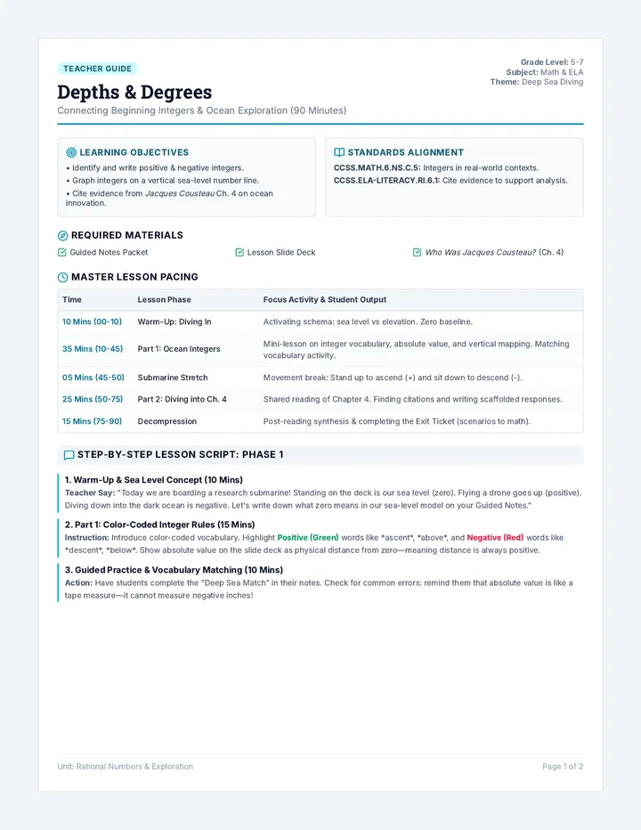
Data Lab Teacher Guide Data Lab Trends
Teacher Facilitation Guide
Grades 7-8
Learning Objectives
Construct and interpret scatter plots for bivariate measurement data.
Describe patterns such as clustering, outliers, positive/negative association, and linear/nonlinear association.
Informally fit a straight line to data and assess the model fit.
Use the equation of a linear model to solve problems in context.
NCSCOS Alignment
8.SP.1: Construct and interpret scatter plots... describe patterns such as clustering, outliers, positive or negative association...
8.SP.2: Know that straight lines are widely used to model relationships... informally fit a straight line.
8.SP.3: Use the equation of a linear model to solve problems... interpret the slope and intercept.
Lesson Pacing (60-75 Minutes)
10 mins
Warm-Up: Trend Spotting
Display Slide 2. Ask students to describe the relationship between height and shoe size. Introduce "Association."
20 mins
Direct Instruction
Use the "Data Lab Slides" to cover positive/negative/no association, outliers, and the "eyeball" method for lines of best fit.
25 mins
Guided Practice: NC Ice Cream Sales
Students complete the "Coastal Cones Activity." Circulate to ensure lines of best fit go through the middle of the data.
20 mins
Independent Practice
Students complete the "Scatter Plot EOG Practice" individually or in pairs.
Teacher Tips
Common Misconception: Students often try to connect the dots. Remind them that a line of best fit is a single straight trend line.
Questioning: "If we draw a line and 90% of the points are above it, is that a 'best fit'?"
NC Connection: Mention how businesses like Outer Banks ice cream shops use this data to decide how much inventory to buy for summer!
Materials Needed
Rulers (essential for lines of best fit)
Graph paper (if using extra data)
Data Lab Slides
Student Worksheets
Discussion Starters
"What happens to the line of best fit if we remove an outlier?"
Guide students to see that outliers pull the line toward them, and removing them might make the model more accurate for the rest of the data.
"Can you have a negative association that is also very strong?"
Yes! Use the example of gas remaining in a car vs. distance driven. The trend is tight but decreasing.
Differentiation Strategies
Scaffolding (Struggling Learners)
Provide scatter plots with the line of best fit already drawn but the equation missing. Focus on interpreting the slope (as temp goes up, sales go up).
Extension (Advanced Learners)
Have students use two points on their line of best fit to calculate the actual slope (\(m\)) and y-intercept (\(b\)) to create a formal equation \(y = mx + b\).
ELL Support
Use visual gestures (arm slanted up for positive, down for negative) to reinforce vocabulary terms alongside the graph.
Data Lab Slides DATA LAB TRENDS
Mastering Scatter Plots and Lines of Best Fit
NCSCOS 8.SP.1-3
Warm Up: Trend Spotting
Look at these two variables:
Shoe Size & Math Score
Temp & Ice Cream Sales
Do you expect a pattern? Why or why not?
Think: If one goes up, what happens to the other?
The Big Three Patterns
Positive
Both variables increase together.
Trend: /
Negative
One increases while the other decreases.
Trend: \
None
No clear relationship between variables.
Trend: ?
Odd Ones Out
Outlier
A data point that is distinctly separate from the rest of the group.
Cluster
A group of data points that are very close together.
OUTLIER!
Informal Line of Best Fit
A straight line that best represents the data on a scatter plot.
Follows the general trend of the points.
Balances points above and below the line.
Can be used to make Predictions !
Prediction Power
If we know the temperature, we can use our line to guess exactly how many cones we will sell today!
Coastal Cones Data
The Outer Banks, NC
Temperature (°F) Cones Sold 75 120 82 185 88 240 92 295 98 350
The Challenge:
Draw a line through these points. Predict how many cones we sell at 100°F!
Predict Trends
Coastal Cones Activity Coastal Cones Lab
Tracking Trends on the Outer Banks, NC
Student:
Date:
The Mission: A local ice cream shop in Nags Head wants to know how much ice cream to prep based on the weather forecast. Use the data from last August to create a scatter plot and identify trends.
Step 1: Record the Data
Temp (°F) Sales 70 85 75 110 78 140 82 175 85 210 88 230 90 260 92 280 95 320 102 150*
*Note: Power outage occurred on this day.
Step 2: Plot and Draw Line of Best Fit
High Temperature (°F)
Ice Cream Sales ($)
6065707580859095100105110
04080120160200240280320360400
Step 3: Analyze & Predict
1. Identify the association shown in your scatter plot (circle one):
Positive Negative None
2. Which point is the outlier? Explain the real-world reason for it.
3. Prediction: If tomorrow's forecast is 100°F, how many sales do you predict?
$
4. Effect: If the outlier were removed, would your line of best fit shift Up or Down? Why?
NCSCOS 8.SP.1 - 8.SP.4 NC DATA LAB: OUTER BANKS SERIES
Scatter Plot EOG Practice NC MATH 8 EOG PRACTICE
Data Analysis & Statistics (8.SP.1-4)
Student:
Score:
/ 8
1
A teacher in Raleigh found a strong positive linear association between study hours and scores. Which scatter plot represents this?
A
B
C
D
2
The scatter plot below shows hours worked at a Charlotte job and money earned. One student’s data point is far from the group at (0, 50). Which term describes this point?
A
Cluster
B
Line of best fit
C
Outlier
D
Negative Association
3
The equation of a line of best fit for NC mountain temperatures is \( y = -0.003x + 85 \), where \(x\) is elevation in feet. What does the -0.003 represent?
A
Temperature at sea level.
B
The change in temperature for every 1 foot of elevation increase.
C
The maximum elevation of the mountains.
D
The number of days below freezing.
4
Which statement best describes a negative association between two variables?
A
As \(x\) increases, \(y\) tends to increase.
B
As \(x\) increases, \(y\) tends to decrease.
C
As \(x\) increases, \(y\) remains constant.
D
No clear relationship exists.
5
An equation \(y = 12x + 10\) models booth pay at the NC State Fair. How much would someone expect to earn if they work 5 hours?
A
$60
B
$70
C
$50
D
$120
6
A researcher finds that as visitors to a NC beach increase, litter collected also increases. This is an example of what type of association?
A
Negative Association
B
No Association
C
Positive Association
D
Non-linear Association
7
Which equation best models a line of best fit for data that passes through the points (0, 10) and (10, 30)?
A
\(y = 10x + 2\)
B
\(y = 2x + 10\)
C
\(y = 20x + 10\)
D
Data Lab Answer Keys DATA LAB ANSWER KEYS
Teacher Reference Only
Scatter Plot EOG Practice
Q1
A
Q2
C
Q3
B
Q4
B
Q5
B
Q6
C
Q7
B
Q8
D
Coastal Cones Activity
Analysis Responses
1. Association: Positive Association (as temperature increases, sales increase).
2. Outlier: The point (102, 150). Reason: Power outage prevented sales despite high demand/temperature.
3. Prediction: Answers will vary slightly based on the line of best fit drawn, but should be approximately $340 - $360.
4. Effect: The line would shift Up. The outlier (102, 150) is significantly below the trend, so it "pulls" the line down. Removing it makes the trend line higher and steeper.
Association Check
POSITIVE
Slope Interpretation
For every 1°F increase in temp, sales increase by ~$10.