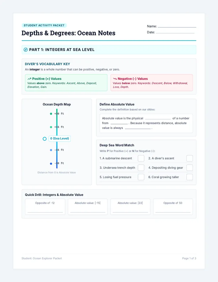
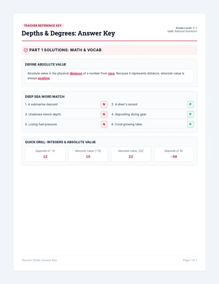
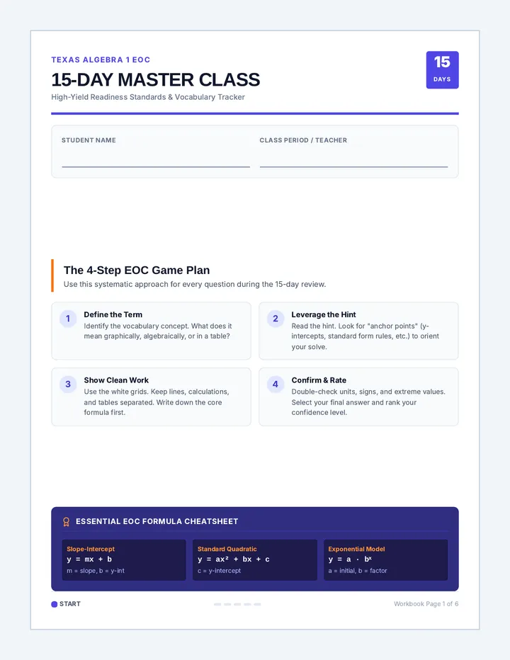
Distribution Diagnostics Slides Data Distribution Diagnostics
Choosing the right tools to compare data sets like a pro.
Tier 2 Intervention Support
Why does shape matter?
Before we compare two groups, we must look at their shape.
"The shape tells us which 'center' and 'spread' are the most honest representatives of the data."
Outliers and skewness can "pull" certain statistics away from the true center.
Case 1: Symmetric Data
The Shape
Bell-shaped, balanced, no extreme outliers.
Use these statistics:
Mean
Standard Deviation
When data is balanced, the mean is the most precise center.
Case 2: Skewed Data
The Shape
Long tail on one side, extreme outliers present.
Use these statistics:
Median
Interquartile Range
The Median is "resistant" – it doesn't care about those crazy outliers!
Which tool for the job?
Scenario A
Number of TikTok followers for 50 students. Most have 100-200, but two students have 1.5 million.
Shape: Skewed Right
Tool: Median & IQR
Scenario B
Amount of sleep (hours) for 100 students. Most get between 6-8 hours, perfectly balanced.
Shape: Symmetric
Tool: Mean & SD
Data Shape Match Up Activity Data Shape Match-Up
Sorting Activity: Shape vs. Statistic
Name: __________________________
Date: __________________________
Instructions:
Cut out the cards below. Match each Data Visualization with its correct Description and the Best Statistics to use for comparison. Paste them in your notebook in sets of three.
Mean & Standard Deviation
Statistical Tool A
Median & Interquartile Range (IQR)
Statistical Tool B
Visualization 1
Visualization 2
Social Media Usage
"Most teenagers spend 2-4 hours on their phones, but a few 'super-users' spend 14+ hours every day."
Scenario X
Standardized Test Scores
"The test scores follow a bell curve. Most students scored near the middle, with very few extremely high or low scores."
Scenario Y
Symmetric
Balance points; mean and median are nearly equal.
Skewed
Pulled to one side by outliers; the mean is unreliable.
Teacher: Use for small group guided practice.
HS.S-ID.A.2
Comparing Centers Worksheet Case File: Comparing Centers
DIAGNOSTIC WORKSHEET
NAME: ___________________________
DATE: ___________________________
SYMMETRIC
Use Mean & Standard Deviation
SKEWED / OUTLIERS
Use Median & Interquartile Range (IQR)
01
Social Media Showdown
Two apps are tracking how many minutes students spend scrolling per day. App A has a balanced distribution around 45 minutes. App B has a skewed right distribution because of a few "power users" who scroll for 10 hours.
1. Which statistics should you use to compare them?
Mean & SD
Median & IQR
Explain your choice:
02
Basketball Scoring
Team Alpha
Symmetric Shape
Mean: 82 pts
Median: 81 pts
St. Dev: 4 pts
IQR: 6 pts
Team Beta
Skewed Right Shape
Mean: 95 pts
Median: 84 pts
St. Dev: 18 pts
IQR: 8 pts
Analysis Task:
Team Beta's mean is higher (95), but they have a few massive outliers. Which center (median or mean) gives a more "typical" view of their score?
Compare the centers. Which team typically scores more points based on the appropriate statistic?
Reflect: Why is the Mean higher than the Median for Team Beta?
Quick Data Check Assessment Exit Ticket
Quick Data Check
Name: ___________________________
1. A dataset representing home prices in a city is skewed right because of several multi-million dollar mansions.
Circle the pair of statistics you should use to summarize this data:
Mean & Standard Deviation
Median & IQR
2. Why did you choose that pair? (Think about the "resistant" center).
How confident do you feel?
🙁
😐
🙂
Intervention Log
PROGRESS MONITORING: HS.S-ID.A.2
Student Name Identify Shape Choose Measure Compare Groups 1. ________________ □ L1 □ L2 □ L3 □ L1 □ L2 □ L3 □ L1 □ L2 □ L3 2. ________________ □ L1 □ L2 □ L3 □ L1 □ L2 □ L3 □ L1 □ L2 □ L3 3. ________________ □ L1 □ L2 □ L3 □ L1 □ L2 □ L3 □ L1 □ L2 □ L3 4. ________________ □ L1 □ L2 □ L3 □ L1 □ L2 □ L3 □ L1 □ L2 □ L3 5. ________________ □ L1 □ L2 □ L3 □ L1 □ L2 □ L3 □ L1 □ L2 □ L3
Key:
L1: Not Yet (Needs heavy support) | L2: Progressing (Inconsistent) | L3: Met (Independent)
Statistics Intervention Guide Intervention Guide
Data Distribution Diagnostics
Learning Objective
Students will be able to identify the shape of a data distribution and select the appropriate measures of center (mean, median) and spread (standard deviation, IQR) to compare two or more datasets.
Standards Alignment
CO: HS.S-ID.A.2
Use statistics appropriate to the shape of the data distribution to compare center and spread of two or more different data sets.
Misconception Alert
! Students often think the Mean is always the "best" average because it is most common.
! Students may mistake Skewed Right (tail on right) for Skewed Left .
Instructional Sequence
1
Direct Instruction (Slides)
Use the Distribution Diagnostics Slides to model identifying shape. Focus on how outliers "pull" the mean. Use the "Mean vs. Median" tug-of-war analogy.
2
Collaborative Sort (Match-Up)
Small groups cut and match the cards. Teacher Prompt: "If I add one student with 1 million followers to this balanced group, which number changes more: the mean or the median?"
3
Guided Practice (Worksheet)
Scaffolded comparison tasks. Ensure students are writing out the reasoning (e.g., "I used the median because the basketball data has an outlier of 140 points").
Questioning Hooks
"Is this distribution a mirror image or does it have a 'tail'?"
"If you were a billionaire, would you want people to look at the mean income or median income of your neighborhood?"
Answer Key Snippet
TikTok Task: App B is Skewed Right. Median/IQR are correct. The mean would be falsely inflated by high-follower users.
Basketball Task: Team Beta typically scores more (Median 84 vs 81). Mean (95) is misleading.