Typography Anatomy Slides Design Lab
Anatomy of
Typography
Understanding the soul of written communication.
Does Font Matter?
The Woods
Coming this Halloween
The Woods
Coming this Halloween
"Typography is what language looks like." — Ellen Lupton
The Great Divide
Serif
Small decorative strokes (feet) at the end of character strokes.
Traditional & Authoritative
High legibility in print
Sans-Serif
"Sans" means "without." Clean, modern strokes without feet.
Modern & Minimalist
High legibility on screens
Anatomy of a Letter
Ag
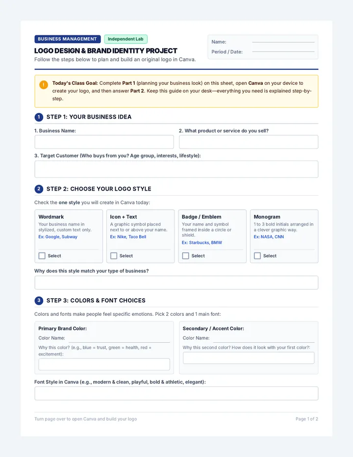
Ascender
Descender
X-HEIGHT
Ascender
Part of the letter that extends above the x-height.
Descender
Part of the letter that falls below the baseline.
Counter
The open or closed negative space inside a letter (like 'o' or 'p').
Breathing Room
Kerning
Adjustment of space between individual letter pairs.
A V A I L
Poor Kerning
AVAIL
Better Kerning
Leading
Vertical space between lines of text (from baseline to baseline).
Tight leading makes reading difficult and cramped.
Loose leading creates more whitespace and breathing room.
Font Personality Lab
Fonts aren't just letters; they have vibes. Your task is to match the "Voice" of the text with the "Visual" of the typeface.
"Typography is a voice. Choose your speaker wisely."
Font Personality Worksheet Font Personality Lab
Anatomy of Typography // Lesson 01
Student Name
Date
The Typography Challenge
Typography isn't just about reading; it's about feeling . Different typefaces carry unique "personalities" that influence how we perceive a message. For each scenario below, choose the best font category and explain your choice.
Scenario 01
"The Law Offices of Miller & Reed"
A high-end law firm specializing in historical landmark protection. They want to look established, trustworthy, and traditional.
Recommended Font Style:
Serif
Sans-Serif
Display/Script
Why does this match the personality?
Scenario 02
"GLITCH: Underground eSports Arena"
A futuristic gaming lounge and tournament space. They want to look tech-forward, high-energy, and modern.
Recommended Font Style:
Serif
Sans-Serif
Display/Script
Why does this match the personality?
Scenario 03
"Little Sprouts Organic Pre-School"
A friendly, nature-based preschool. They want to look approachable, gentle, and child-friendly.
Recommended Font Style:
Serif
Sans-Serif
Display/Script
Why does this match the personality?
The Typography Dissection
Anatomy Identification Exercise
Task 04: Identify Anatomy
Using the word provided, draw arrows pointing to and labeling at least five unique typographic features (e.g., Serif, Ascender, Descender, Counter, X-Height, Baseline, Bowl).
Typography
Typography
Task 05: Leading & Kerning Check
In the box below, sketch the same word twice. In the first, use tight kerning . In the second, use loose kerning .
Reflection Question
How does changing the leading (the space between lines) affect how a reader feels when looking at a dense paragraph of text?
Typography Anatomy Cheat Sheet Anatomy of
Typography
The Designer's Cheat Sheet
Visual Dissection
Hygp
ASCENDER
Cap Height
X-Height
Counter
DESCENDER
Serif
The Fundamentals
Serif: A small stroke attached to the end of a larger stroke in a letter. (Think: "Feet")
Sans-Serif: A style of type without serifs. "Sans" means "without" in French.
Baseline: The invisible line on which most letters sit.
Bowl: The fully closed, rounded part of a letter (e.g., in 'b' or 'o').
Spacing & Scale
Kerning: Adjusting the space between two individual letters to improve visual balance.
Tracking: Adjusting the space uniformly across a range of characters .
Leading: The vertical space between lines of text , measured from baseline to baseline.
X-Height: The height of lower-case letters, specifically the lowercase 'x'.
Design Pro-Tips
Never use more than 2-3 different fonts in one design.
Pair a bold Sans-Serif heading with a readable Serif body font.
Standard leading is usually 1.2x to 1.5x the font size.
Visual Hierarchy Slides Design Lab
Eye Control
Hierarchy, Grids, and the Invisible Skeleton of Design.
Why is this painful?
BAD AD
BIG SALE!!!!
Buy one get one free for limited time only and also we have free shipping if you spend more than fifty dollars but only on tuesdays and we are located on main street next to the bank and also we have puppies.
CLICK HERE
50% OFF EVERYTHING
The Diagnosis:
No entry point (Where do I look?)
Competing elements
Lack of negative space
1. Scale
Size creates dominance. The largest element on the page is almost always the first thing the eye sees.
Pro-Tip: If everything is important, nothing is important.
01 Headline Subhead text sits here
2. Color & Contrast
Isolation
A single pop of color in a sea of neutrals acts like a magnet for the eyes.
Value
Dark text on light backgrounds (or vice-versa) ensures high readability.
Emphasis
Use color to group related information or highlight call-to-actions.
The Grid Skeleton
A Grid is a series of intersecting vertical and horizontal lines used to structure content.
Alignment: Connects disparate elements through shared edges.Balance: Distributes visual weight across the layout.Efficiency: Speeds up the design process by limiting choices.
IMAGE
Headline Area
The Rule of Thirds
FOCAL POINT ACTIVATED
Avoid centering everything. Placing your subject on the intersections creates more tension, energy, and interest.
"Design is the silent ambassador of your brand." — Paul Rand
Grid Master Worksheet Grid Master
Visual Hierarchy // Lesson 02
Student Name
Date
01
The Eye-Tracker Challenge
Look at the layout below for exactly three seconds . Then, close your eyes and answer the questions that follow.
EPIC EVENT
SOLSTICE
Music & Art Festival
Tickets From
$45
Location
Emerald Valley Amphitheater
Date
JUNE 21-23
1. What was the very first thing you saw?
2. What element used "Scale" to grab attention?
02
The Invisible Skeleton
Your task is to design a social media post for a new shoe brand called "Veloce" . You must use the modular grid provided below to organize your text and image placeholders.
Required Elements:
Brand Name (Veloce)
One Hero Image (Placeholder Box)
One Price Callout
Tagline: "Speed Refined"
Design Tip:
Try to align your elements to the grid lines. Leave at least 2 grid squares empty to create "Negative Space."
Explain your grid choice:
How did you create focal point?
Layout Critique Guide Critique Guide
Visual Hierarchy & Layout Design
Teacher Resource
Facilitating the Critique
Critique is a skill, not just a grade. Use this guide during the "Grid Master" project or peer review sessions to help students move beyond "I like it" or "it looks cool" into technical analysis.
1. Scale & Dominance
"Where does my eye land first?"
Questions to Ask Students:
Is there a clear 'entry point' to the design?
Is the most important information also the largest?
What is the 'supporting cast' in this hierarchy?
What to Look For:
Contrast between the headline and the body text. Look for at least a 3x size difference for effective hierarchy.
2. Alignment & Grids
"Is there a skeleton underneath?"
Questions to Ask Students:
Do elements line up with one another?
Does the design feel 'anchored' or 'floating'?
How does the whitespace (negative space) impact the flow?
What to Look For:
Elements that 'staircase' or feel randomly placed. Check if the edges of text blocks align with edges of images.
3. Color & Contrast
"Can I read this from 5 feet away?"
Questions to Ask Students:
Is the text legible against the background?
Does the color reinforce the 'vibe' of the message?
Are colors used to highlight buttons or key info?
What to Look For:
Light gray text on white backgrounds or busy images. Check for 'vibrating' color combinations (red/blue).
Feedback Sentence Stems
"The scale of the [element] really helps to..."
"I'm noticing the alignment between the [A] and [B] creates..."
"The negative space around the [element] provides..."
"The contrast could be improved by..."
Vector Power Slides Design Lab
Vector
Power
Infinite Scale, Perfect Precision.
Pixels vs. Paths
Raster (JPEG/PNG)
Made of fixed colored squares. Blurs when enlarged.
Vector (SVG/AI/EPS)
Made of mathematical paths. Stays sharp at any size.
"A vector is a line between two points defined by math, not pixels."
The Mighty
Pen Tool
It’s the most powerful—and most frustrating—tool in design. Master it, and you can draw anything.
Anchor Points: The "bones" of your shape.Bezier Handles: Control the curve's direction and pull.
PATH ACTIVE
Shape Building
Overlap
Combine
Complex Logo
"Good logos are just simple shapes rearranged."
The Logo Litmus Test
Simple
Easy to recognize and remember instantly.
Scalable
Works on a business card and a billboard.
Timeless
Avoids trends that will look dated in 5 years.
Versatile
Works in one color (black & white).
Pen Master Worksheet Pen Master
Vector Graphics // Lesson 03
Student Name
Date
The Path to Perfection
Before moving to the software, we must train the brain to see Anchor Points and Bezier Handles . Trace the paths below, marking where you would click (Anchor) and where you would pull (Handle).
Level 1: Geometric Precision
Trace this shape. Mark each corner with an 'X'. How many total anchor points?
SQUARE.SVG
Trace the lightning bolt. Be careful with the inner corners.
Level 2: The Curve Control
Draw the Bezier Handles for these circles. Remember: Handles should follow the direction of the curve.
Level 3: Personal Monogram Concept
Combine your first and last initials into a single, cohesive shape. Focus on overlap and subtraction . Sketch three variations below.
Variation A
Variation B
Variation C
Which one will you digitize and why?
The Color Spectrum Slides Design Lab
CMYK vs RGB
Light vs. Ink. The Battle of Color Gamuts.
The Neon Nightmare
SCREEN (RGB)
Vibrant, Glowing, Electric.
PRINT (CMYK)
Dull, Flat, Muddy.
Why does this happen?
RGB: Additive
Used for anything on a Screen . It uses Light to create color.
Red, Green, Blue
R + G + B = PURE WHITE
Higher Gamut (More colors possible)
WHITE
K
CMYK: Subtractive
Used for anything Printed . It uses Ink to block light.
Cyan, Magenta, Yellow, Key (Black)
C + M + Y = MUDDY BLACK
Lower Gamut (Cannot print neons)
The Magic of Halftones
Cyan
Magenta
Yellow
Black (K)
Look closely at a cereal box or a comic book. You’ll see millions of tiny colored dots working together to trick your brain.
Ink and Light Worksheet Ink & Light
Color Theory for Print // Lesson 04
Student Name
Date
Activity 1: RGB vs CMYK
For each output below, identify if the designer should work in RGB or CMYK mode.
A Billboard on Times Square
RGB
CMYK
A Business Card
RGB
CMYK
A Social Media Ad
RGB
CMYK
A Cereal Box
RGB
CMYK
Activity 2: The Neon Problem
"I designed a logo with a bright neon green background, but when I printed it on my home printer, it came out looking like olive drab. Why?"
Explain the concept of "Color Gamut" and why neons are difficult to print using CMYK:
Activity 3: Halftone Reconstruction
To create Orange in CMYK, which two inks are primarily used? Estimate the percentage of each in the dots below.
Ink Color 1:
Ink Color 2:
Technical Reflection
If you were designing a poster for a rock concert and the client insisted on neon pink , what physical print process might you recommend besides standard CMYK offset printing?
Mockup Magic Slides Design Lab
Mockup
Magic
From the Screen to the Streets.
The Design Bridge
A Mockup is a scale or full-size model of a design used to demonstrate how it will look in the real world.
Visualization: Helps clients see the product before it's manufactured.Scale Check: Does the logo look too small on a t-shirt? Is the text readable on a billboard?
MOCKUP
The Art of the Pitch
Being a great designer is only 50% of the job. The other 50% is selling your vision .
"Don't just show them what you did. Tell them why you did it."
Goals
Audience
Anatomy
Hierarchy
Final File Preparation
Vectors
Convert all text to outlines (Expand). Ensure no stray anchor points exist.
Color
Switch document mode to CMYK . Check for muddy colors or neons that won't print.
Format
Save as a high-quality PDF with bleeds and crop marks if necessary.
Takeoff
It's time to put your work in context. Choose a mockup that matches your brand's lifestyle and prepare your 2-minute pitch.
Client Meeting: Tomorrow
Design Pitch Worksheet Design Pitch
Final Portfolio Project // Lesson 05
Designer Name
Project Title
Phase 1: The Brief
1. Who is the target audience (Client)?
Age, interests, and the "vibe" they expect.
2. What problem does this design solve?
What is the message or brand promise?
Phase 2: Design Choices
Typography Choice
Describe the font choice and personality...
Hierarchy Strategy
How did you lead the eye first?
Color Palette (CMYK)
List your primary ink values...
Phase 3: The Pitch Script
You have 120 seconds to convince the client that your design is the best solution. Use the structure below to outline your talk.
The Hook (0-20s)
Introduce yourself and the 'big idea' of the brand.
The Rationale (20-80s)
Walk through your mockup. Explain the typography and hierarchy choices.
The Closing (80-120s)
Summarize why this design will succeed in the real world.
Peer Review Notes
One Strength:
One Area to Grow:
Project Evaluation Rubric The Designer's
Standard
Rubric & Pre-Flight Checklist
Pre-Flight Checklist
Outlined Text
All fonts converted to vector paths (No missing fonts).
CMYK Color Mode
Document color mode set for physical ink production.
Resolution & Scale
Vector elements are scalable; raster images are 300+ DPI.
Contextual Mockup
Design is placed on a realistic, high-quality template.
Final Project Rubric
Criteria Exceeds (4) Meets (3) Developing (2) Typographic Anatomy Flawless choice of font that perfectly matches brand personality. Font matches personality; leading/kerning is mostly balanced. Font choice clashes with brand; spacing feels awkward. Hierarchy & Grids Masterful use of scale and grid alignment. Eye path is intuitive. Strong hierarchy with clear focal point. Mostly aligned to grid. Weak hierarchy; elements feel cluttered or disconnected. Vector Technicality Clean anchor points; complex shape building used effectively. Solid pen tool use; simple shapes combined cleanly. Pixelation present; stray points; messy path junctions. Professional Pitch Persuasive, technical justification; professional delivery. Clear presentation of choices; mostly confident delivery. Lacks justification for design choices; reading from script.
Final Evaluation
SCORE:
/ 16