Portrait Type Teacher Guide High School Graphic Design • Teacher Guide
Portrait Type Studio
Grades 9–12
3 Sessions (50–60 min each)
Lesson Overview
Students bridge observational drawing and systematic graphic design by translating the expressive traits of hand-drawn character portraits into an original display typeface. Rather than copying existing fonts, students make independent structural decisions about proportion, stroke contrast, terminals, and negative space.
Learning Objectives
Analyze typographic anatomy (x-height, ascenders, descenders, counters, terminals, stroke contrast) and expressive voice.
Translate visual qualities from a hand-drawn character portrait into consistent, repeatable letterform rules.
Execute a cohesive set of hand-drawn glyphs and a specimen wordmark using typographic grid guidelines.
Materials Needed: Typeface Anatomy Worksheet, Character Grid Studio Sheet, pencils (2H/2B), fineliners/brush pens, tracing paper, rulers.
Instructional Pacing
Session 1: Typographic Anatomy & Portrait Concept
50 min
Present Portrait Type Slides (Slides 1–3). Lead a close-looking analysis comparing high-contrast editorial serifs with geometric sans-serifs. Students complete Part 1 & 2 of the Typeface Anatomy Worksheet and sketch their character portrait on the Character Grid Studio Sheet .
Session 2: Rule-Setting & Key Glyph Construction
55 min
Review Slides 4–5 on independent design decisions and glyph DNA (H, O, A, g). Students lock in their structural parameters (x-height ratio, stroke contrast, terminal style) in Part 3 of the worksheet, then draft their 4 anchor glyphs in pencil before inking.
Session 3: Extended Specimen & Foundry Critique
55 min
Students expand their system into a 5–7 letter custom wordmark on Page 2 of the Studio Sheet, refining spacing (kerning) and optical balance. Conclude with a silent gallery walk and structured peer critique (Slide 6).
Deeper Typography Analysis Prompts
1. Structural Tension & Contrast
“Where does the thick-to-thin transition occur? How does high contrast feel different from monolinear weight?”
2. Negative Space & Counters
“Look only at the white space inside ‘O’, ‘A’, and ‘g’. Are the counters open and approachable, or tight and guarded?”
PORTRAIT TYPE STUDIO • TEACHER GUIDE PAGE 1 OF 2
Design Decisions, Differentiation & Assessment
Facilitation Notes
Independent Design Decision Checkpoints
Avoid giving students a single template style. Push them to defend their own choices during desk conferences:
Proportion & Stance
Does a tall, narrow portrait translate into condensed letterforms with a high x-height, or wide, grounded capitals?
Stress & Weight
Should the stroke axis be vertical (rational) or angled (humanist)? Which pen nib or marker angle achieves this?
Terminals & Serifs
How do hairlines, eyelashes, or sharp jawlines become consistent ball terminals, wedge serifs, or sheared cuts?
Optical vs. Literal
Coach students away from drawing tiny faces inside letters. The goal is structural translation , not clipart.
Scaffolding & Support
Provide tracing paper overlays so students can refine curves over their pencil skeleton without erasing the grid.
Offer a curated “trait-to-type” word bank (e.g., angular → chamfered corners; whimsical → swash terminals ).
Allow focus on 4 uppercase anchor letters (H, O, A, S) before attempting lowercase ‘g’.
Extension & Challenge
Design a matching punctuation mark (&, ?, or !) that captures the portrait’s signature expression.
Develop an italic or bold weight variant of their 4 anchor glyphs to demonstrate systematic family thinking.
Digitize inked glyphs via scan/vector trace and test kerning pairs in a digital layout.
Assessment Criteria (Studio Rubric)
Criterion
Exemplary (4)
Developing (2)
Portrait-to-Type Translation
Clear, inventive structural link between portrait traits and letterform anatomy without literal clipart.
Connection between portrait and letters is superficial or relies on decorative add-ons.
System Consistency
Uniform x-height, stroke contrast, and terminal treatment across all glyphs and wordmark.
Letterforms feel unrelated; inconsistent baseline alignment or stroke weights.
Craft & Spacing
Crisp ink work, balanced counters, and intentional optical kerning in the final wordmark.
Rough edges, uneven spacing between letters, or rushed pencil/ink execution.
PORTRAIT TYPE STUDIO • TEACHER GUIDE PAGE 2 OF 2
Portrait Type Slides Graphic Design Studio Grades 9–12
Portrait Type Studio
Translating hand-drawn character portraits into original, expressive display typefaces.
Anatomy • Expression • System Design Session 1–3
Typefaces Have Personality
Close Looking
Aa Bb Gg
High-Contrast Serif
Sharp thick-to-thin transitions, delicate hairlines, and sculpted terminals feel editorial, dramatic, and poised.
Aa Bb Gg
Geometric Sans
Monolinear strokes, circular counters, and blunt terminals feel direct, mechanical, and assertive.
Discussion: If each typeface walked into a room as a character, how would they stand, dress, and speak?
Anatomy You Control
Vocabulary
X-Height
Height of lowercase letters. Tall x-height feels open and modern; short feels classic.
Stroke Contrast
Difference between thick stems and thin hairlines. Creates rhythm and tension.
Counters
Enclosed negative space inside letters like ‘O’, ‘A’, and ‘g’.
Ascender & Descender
Parts rising above x-height (‘h’, ‘b’) or dropping below baseline (‘g’, ‘y’).
Terminals
The end of any stroke without a serif: ball, sheared, flared, or blunt.
Axis / Stress
The angle of thinnest strokes in curved letters like ‘O’.
Translate, Don’t Illustrate
Core Concept
Portrait Trait
• Sharp jawline & angular cheekbones
• Curled hair or swooping lashes
• Tall, narrow posture
• Wide, expressive eyes
Typographic Rule
→ Chamfered corners & wedge serifs
→ Ball terminals & swash descenders
→ Condensed width & tall ascenders
→ Oversized, open circular counters
Rule of thumb: Never draw tiny faces inside letters. Capture the character’s structure and rhythm.
Studio Workflow
Your Decisions
01
Draw Portrait
Sketch an expressive character face with clear line weight and mood.
02
Set Your Rules
Lock in x-height, contrast, stress angle, and terminal style.
03
4 Anchor Glyphs
Build H, O, A, and g to test straight, round, diagonal, and descender DNA.
04
Wordmark
Expand into a 5–7 letter name with balanced optical spacing.
Pencil skeleton first → refine curves → ink with precision.
Foundry Critique
Peer Review
1. Voice Match
Can you identify the portrait’s mood just by looking at the letterforms?
2. System Unity
Do all letters belong to the same family in weight, terminals, and x-height?
3. Optical Space
Where does the spacing between letters feel too tight or too loose?
Give one specific praise on craft and one actionable suggestion for consistency.
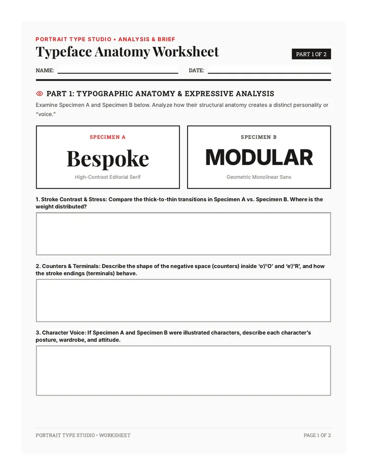
Typeface Anatomy Worksheet Portrait Type Studio • Analysis & Brief
Typeface Anatomy Worksheet
PART 1 OF 2
Name:
Date:
Part 1: Typographic Anatomy & Expressive Analysis
Examine Specimen A and Specimen B below. Analyze how their structural anatomy creates a distinct personality or “voice.”
Specimen A
Bespoke
High-Contrast Editorial Serif
Specimen B
MODULAR
Geometric Monolinear Sans
1. Stroke Contrast & Stress: Compare the thick-to-thin transitions in Specimen A vs. Specimen B. Where is the weight distributed?
2. Counters & Terminals: Describe the shape of the negative space (counters) inside ‘o’/‘O’ and ‘e’/‘R’, and how the stroke endings (terminals) behave.
3. Character Voice: If Specimen A and Specimen B were illustrated characters, describe each character’s posture, wardrobe, and attitude.
PORTRAIT TYPE STUDIO • WORKSHEET PAGE 1 OF 2
Design Brief & System Rules
PART 2 OF 2
Part 2: Character Portrait Translation Matrix
Define your character’s personality in 3–4 adjectives, then translate four specific visual traits from your portrait sketch into repeatable typographic rules.
Character Name & 3–4 Personality Adjectives:
Portrait Visual Trait
Translated Typographic Rule
Part 3: Independent Design Parameters
Commit to your structural system before drawing on the Character Grid Studio Sheet. Circle one option per row or define your own custom rule.
X-Height Ratio: Low (classic) Medium (balanced) Tall (modern/bold)
Stroke Contrast: Monolinear (even) Moderate contrast High contrast (dramatic)
Stress Axis: Vertical (0°) Angled (humanist) Reverse / Horizontal
Terminals / Serifs: Blunt / Squared Ball / Rounded Wedge / Flared
Proposed Typeface Name & Intended Use (e.g., poster, book cover, game title):
PORTRAIT TYPE STUDIO • WORKSHEET PAGE 2 OF 2
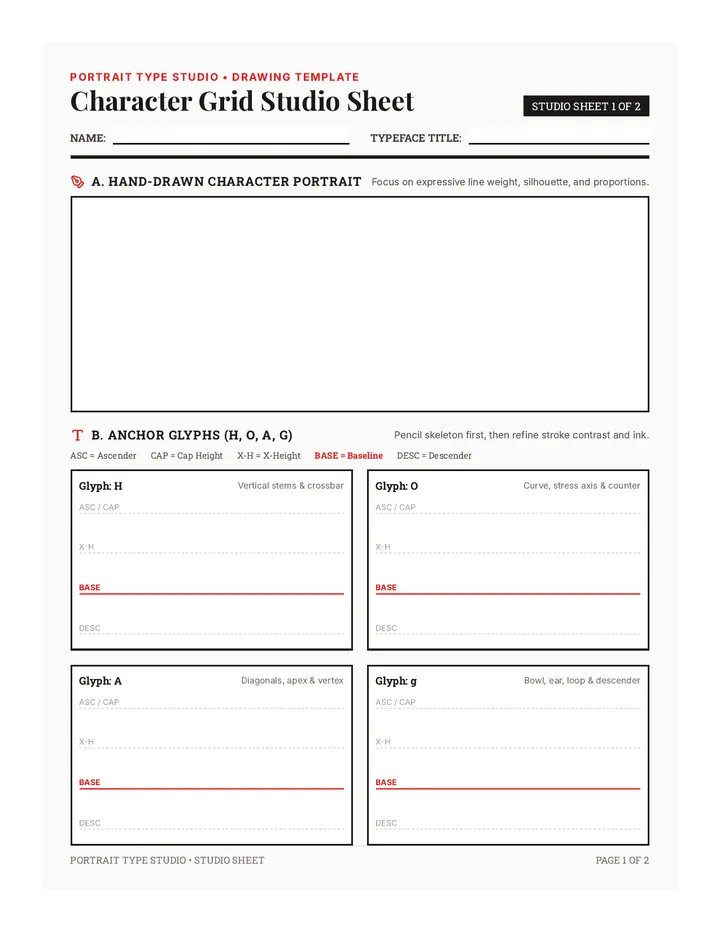
Character Grid Studio Sheet Portrait Type Studio • Drawing Template
Character Grid Studio Sheet
STUDIO SHEET 1 OF 2
Name:
Typeface Title:
A. Hand-Drawn Character Portrait
Focus on expressive line weight, silhouette, and proportions.
B. Anchor Glyphs (H, O, A, g)
Pencil skeleton first, then refine stroke contrast and ink.
ASC = Ascender CAP = Cap Height X-H = X-Height BASE = Baseline DESC = Descender
Glyph: H Vertical stems & crossbar
ASC / CAP
X-H
BASE
DESC
Glyph: O Curve, stress axis & counter
ASC / CAP
X-H
BASE
DESC
Glyph: A Diagonals, apex & vertex
ASC / CAP
X-H
BASE
DESC
Glyph: g Bowl, ear, loop & descender
ASC / CAP
X-H
BASE
DESC
PORTRAIT TYPE STUDIO • STUDIO SHEET PAGE 1 OF 2
Specimen Wordmark & Critique
STUDIO SHEET 2 OF 2
C. Specimen Wordmark Composition (5–7 Letters)
Use Band 1 to test letter spacing (kerning) and rhythm in pencil. Use Band 2 for your final inked specimen wordmark and an optional punctuation mark (&, !, ?).
Band 1: Spacing & Rhythm Draft
ASCENDER / CAP
X-HEIGHT
BASELINE
DESCENDER
Band 2: Final Inked Specimen Wordmark
ASCENDER / CAP
X-HEIGHT
BASELINE
DESCENDER
D. Foundry Peer Critique Notes
Exchange sheets with a partner. Record one strength in portrait-to-type translation and one suggestion for system consistency or optical spacing.
PORTRAIT TYPE STUDIO • STUDIO SHEET PAGE 2 OF 2