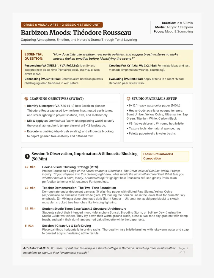
Ink Power Slides Ink &
Impact
History, Social Change, and the Reduction Method
The Ultimate Sacrifice
Case Study 01
Imagine a 5-color print with perfect registration...
To create this image, the artist had to destroy the block as they worked.
"Once you carve for the next color, there is no going back. The previous state is gone forever."
How does this "no-return" policy change the way an artist thinks?
The People's Medium
Social Movements
Relief printing was the original "social media." It allowed for mass reproduction of powerful imagery to reach the public quickly and cheaply.
German Expressionism: Raw, jagged lines reflecting post-war trauma (Käthe Kollwitz).WPA Posters: Bold colors and clear typography promoting public works and health.
Visual Strategies
How they caught the eye:
High Contrast
No grays—just bold presence.
Symbolism
Universal icons for quick reading.
Text Integration
Typography as part of the cut.
Dynamic Lines
Expressive movement in gouge marks.
The Reduction Logic
STATE 1
Preserve White
Carve what stays paper color. Print the lightest ink.
STATE 2
Preserve Light
Carve what stays Color 1. Print Color 2 (Darker).
STATE 3
Repeat
Carve Color 2 areas. Print Color 3.
FINAL STATE
The Key Block
Only the darkest details remain on the block.
Rule: Lightest to Darkest. Always.
The Roadmap
Before we touch a gouge, we must have a plan.
1
Color Mapping
Break your reference image into 3–4 distinct values/colors. Label them clearly.
2
Carving Logic
Think backward. What is the paper color? What is the first ink? What stays?
3
The Key Design
Your final "key" layer needs enough detail to pull the whole image together.
"Measure twice, carve once. Your planning is your safety net."
Impact Analysis Teacher Guide The Power of the Press
Teacher Facilitation Guide | Lesson 1
Case Study Focus
Lesson Overview
This lesson bridges the historical significance of relief printing with the technical logic of the reduction method. Students will move from viewing prints as agents of social change to understanding them as complex technical puzzles.
Key Learning Objectives
Analyze how relief printmaking’s formal qualities (contrast, line) support social messaging.
Articulate the "subtractive logic" of reduction printing.
Translate a 3-4 color image into a sequential carving plan.
Materials Needed
Ink Power Slides
Reduction Roadmap Worksheets
Reference image examples (multi-color)
Tracing paper & colored pencils (for planning)
Case Study Discussion Prompts
German Expressionism (Kollwitz, Die Brücke)
"Look at the jaggedness of the lines. Why use woodcut instead of a soft pencil drawing for a protest poster?"
Desired Insight: The physical act of gouging into wood mimics the violence or intensity of the social struggle. The high contrast removes ambiguity—it is black and white, right and wrong.
The WPA & Social Realism
"These prints were meant for public squares, not museums. How does the flat color and bold type help communicate to a person walking by?"
Desired Insight: Visual clarity, legibility from a distance, and the industrial feel of the print align with the 'worker' identity of the era.
The Conceptual Leap: Reduction Logic
Reduction printing is counter-intuitive. Use the following script or talking points to guide the transition to the technical demo:
1 The Destruction: "In a standard print, you have one block for every color. In reduction, the block is an endangered species. Every cut you make for the second color destroys the chance to ever print the first color again."
2 Thinking in Reverse: "Usually, we add color to a white page. Here, we are removing material to keep color on the page. You aren't carving the drawing—you are carving the spaces AROUND the drawing."
3 The Trap: "The most common mistake is carving too much too early. If you carve it now, it stays the color of the paper forever."
Common Student Hurdles
Color Confusion
Students often forget that the FIRST color printed stays in the areas they CARVE for the second layer.
Registration Anxiety
Reassure them that Lesson 2 focuses on the mechanics of alignment; today is strictly for the mental map.
Reduction Roadmap Worksheet Reduction Roadmap
Strategic Planning & Color Separation
Student:
Date:
"The reduction print is a ghost of a block. Once you move to the next stage, the previous one is carved away forever. Plan with precision."
1. Your Color Palette (Lightest to Darkest)
PAPER WHITE
Stage 0: Paper
Color 1 (Lightest)
Color 2 (Mid-tone)
Color 3 (Key Dark)
2. The Subtractive Plan
1
Stage 1: Preserving White
BEFORE FIRST INK
What areas of your design will remain the color of the paper? Describe what you will carve away now:
2
Stage 2: Preserving Color 1
BEFORE SECOND INK
You have printed Color 1 over the whole block. Now, what areas of Color 1 do you want to keep? Carve these away next:
3
Stage 3: Preserving Color 2
BEFORE FINAL INK
You have printed Color 2. What highlights or textures of Color 2 should remain? Everything else will become Color 3 (the Key):
CARVE AREA = KEEPS CURRENT COLOR
Registration Check:
Transfer Tactics Slides Transfer
& Prep
The technical foundation of the edition
1. Preparing the Surface
Sanding the Lino
New linoleum often has a factory coating. Use fine-grit sandpaper (220+) to lightly scuff the surface. This helps the ink "grab" the block.
Toning the Block
Stain the block with a thin wash of watered-down acrylic or ink (red or blue).
Visibility is Key
If you can't see where you've carved, you can't be precise.
2. The Mental Flip
AM
Original
AM
Transferred
REMEMBER: Text and directional elements MUST be reversed on the block.
3. Transfer Techniques
Carbon/Graphite
Place graphite paper face down on block.
Tape drawing on top (reversed!).
Trace firmly with a ballpoint pen.
Iron-On (Laser Print)
Must be a fresh laser toner copy.
Place toner-side down on block.
Heat with an iron for 20-30 seconds.
Peel back slowly.
4. Registration Systems
The T-Bar
Pencil marks on the back of the paper that align with marks on the press or block-bed.
Corner Jig
A heavy L-shaped frame (wood or thick card) where the block and paper are tucked into the same corner every time.
Pins/Tabs
Plastic tabs taped to the paper that lock into metal pins mounted on the printing surface. (Most Precise)
"Registration is the difference between a masterpiece and a blurry mess."
Perfect Alignment Reference Sheet Perfect Alignment
Advanced Registration Systems
In reduction printing, your paper must land in the exact same spot on the block for every single layer. A 1mm shift creates "ghosting" or unwanted gaps. Choose one system and stick to it for the entire edition.
1
The Corner Jig
Top-Down View
How it works:
• Secure an "L" shaped guide (wood or matboard) to your workspace.
• Tuck the block firmly into the corner.
• Lower the paper so its corner meets the jig's corner.
Best for: Small to medium blocks with square-cut paper.
2
The T-Bar System
|
——
Paper Reverse View
How it works:
• Mark "T" and "Bar" lines on the back of your printing paper.
• Align these marks with corresponding lines on your press bed or registration board.
• Allows for flexible margins around the image.
Best for: Printing without a press (hand-barren).
3
Registration Pins (Pro Level)
How it works:
• Tape two plastic "tabs" (with pre-punched holes) to the top of every sheet in your edition.
• Snap the tabs onto metal pins taped to your work surface.
• The block is secured in a fixed position relative to the pins.
This is the gold standard for multi-color reduction prints.
Consistency Check:
Do not change your registration board or pin placement once you have printed the first color. Even a hair-width move will misalign all future layers.
Studio Setup Teacher Checklist Studio Logistics
Teacher Checklist | Lesson 2 Workshop
Lab Prep
Lesson 2 is a high-movement technical workshop. The room should be organized into "Stations" to prevent bottlenecks and ensure safety during prep and transfer.
Station 1: Surface Prep
Materials Needed
220+ Grit Sandpaper
Toning Wash (Acrylic + Water)
Sponge brushes or rags
Lint-free cloths
Teacher Notes
Encourage students to tone their blocks lightly. If the stain is too thick, it will peel off with the ink during the first print. It should be a transparent wash.
Station 2: The Heat Transfer
Materials Needed
2-3 Household Irons
Heat-safe pads or ironing boards
Parchment paper (barrier)
Laser-printed reversed designs
Safety & Flow
Limit this station to 2 students at a time. Remind students: "Heat the block, not just the paper." If transfers are patchy, the block was likely too cold.
Station 3: Registration Anchoring
Materials Needed
Registration Pins & Tabs
High-tack tape (Gaffer or Duct)
Heavy matboard or plywood bases
The "Lock-In"
Students must secure their registration system to their board TODAY. Once it is taped down, it stays there for the duration of the project (approx 2 weeks).
End of Lesson Goal:
Every student should have a toned block with a transferred design (reversed) and a registration system secured and ready for the first carve in Lesson 3.
Gouge Grace Slides The First
State
Carving for the Light
The Golden Rule
"Carve away,
Keep your non-carving hand behind the tool or at the very edge of the block.
Use a bench hook to secure the block.
Let the tool do the work—don't force it.
Dull tools are dangerous. Ask for a hone!
Mind Your Fingers
The gouge does not care if it's cutting lino or skin. Stay vigilant.
Know Your Gouges
V
V-Gouge (Small/Medium)
Used for fine lines, details, and outlining. It creates a deep, narrow furrow.
Fine Detail / Outline
u
U-Gouge (Small)
Versatile. Used for mid-weight lines and textures. Rounded bottom makes for smoother transitions.
Texture / Mid-Weight
U
U-Gouge (Wide)
The "Clearer." Used to remove large areas of material quickly. Leaves broad, flat troughs.
Mass Clearing
Dynamic Mark-Making
In relief printing, how you carve is as important as what you carve.
The Noise of the Print
Avoid "dead" white spaces. Use rhythmic marks to suggest form, value, and energy.
Cross-Hatching
Stippling
Contour Lines
Flicker/Short Strokes
Mission: Preserve the White
Outline areas intended to remain pure white with a fine V-Gouge.
Use the wide U-Gouge to clear large white backgrounds.
Add textural marks in transition areas to soften the contrast between paper and first ink.
Silence Your Mind. Focus on the Blade.
Negative Space Practice Sheet Negative Space
Mark-Making & Texture Practice
Student: __________________
Before carving your block, use a fine-liner or ink pen to practice the visual "noise" of your marks. In printmaking, every mark you MAKE is an area you TAKE away. These white marks will define the form against the coming ink.
1. Rhythmic Parallel Lines
V-GOUGE STYLE
Practice varying the distance between lines to create a value gradient.
2. Contour Cross-Hatch
U-GOUGE STYLE
Follow the "curve" of an imaginary object. Cross lines at slight angles.
3. Flick / Short Bursts
SMALL U-GOUGE
Create a "fur" or "grass" texture using short, energetic marks.
4. Mass Clearing Pattern
WIDE U-GOUGE
Practice removing large "background" areas around a focal point.
The "Silent Carve" Reflection
During today's carving session, focus on the physical resistance of the material. What did you notice about the difference between a shallow cut and a deep cut?
Safety First Teacher Log Safety First Log
Carving Proficiency & Safety Certification
Safety Critical
Before students begin independent carving, the instructor must observe and sign off on their safe handling of the gouges. Use this log to track student proficiency during the Lesson 3 workshop.
C1: Direction
Always carving AWAY from the body and non-dominant hand.
C2: Hand Placement
Non-dominant hand is behind the blade or on the bench hook.
C3: Control
Student uses controlled strokes; does not force the tool.
Student Name C1 C2 C3 Instructor Initials Notes / Redirection 1. ______________________ _________ 2. ______________________ _________ 3. ______________________ _________ 4. ______________________ _________ 5. ______________________ _________ 6. ______________________ _________ 7. ______________________ _________
Protocol for Minor Injuries:
• Immediately stop carving and notify the instructor.
• Apply direct pressure with a clean paper towel.
• Clean wound at the sink with mild soap and water.
• Apply a bandage. Do not resume carving until the instructor approves (hand may be too shaky).
Rolling Right Slides Rolling
Right
Inking Mechanics & Registration
The Science of the Slab
Listen for the "Hiss"
When you roll out your ink, you should hear a soft, velvety hissing sound.
Sticky/Smacking: Too much ink.
Silent/Rough: Not enough ink.
The Orange Peel Texture
Look closely at the ink slab. It should have a fine, uniform texture like the skin of an orange.
Inking the Block
Charge the brayer (roller) in multiple directions on the slab.
Apply to the block using a "star" pattern—horizontally, vertically, and diagonally.
Do not press down hard. Let the ink transfer naturally.
The Alignment Routine
Every time you print, follow these 4 checkpoints:
1. Block is Locked
2. Tabs are Snapped (or Corner met)
3. Hands are Clean
4. Blanket is Smooth
THE ENEMY: INK FINGERS
Check your fingers BEFORE touching the printing paper. One smudge ruins a sheet.
The Press vs. The Barren
Using the Press
Ensure even pressure on both sides of the roller.
Move at a slow, steady pace—no stopping mid-print.
Use a "carrier" sheet to protect the blankets.
Hand Burnishing
Apply firm pressure in small, circular motions.
Check a corner before removing the paper completely.
Work from the center outward to avoid paper ripples.
The "Pull" Check
SQUASHED
Detail lost. Edges are blurry. Too much ink.
SALTED
White speckles in the color. Not enough ink or pressure.
JUST RIGHT
Flat, rich color. Clean edges. No ghosting.
Your first print is your "Artist Proof" (A/P). Adjust ink and pressure accordingly.
Press Problems Troubleshooting Guide Press Problems
Troubleshooting & Print Quality
Printmaking is a practice of constant adjustment. Your first print (the A/P) is rarely perfect. Use this guide to analyze your "pull" and refine your technique.
Problem
The Salted Print
White speckles or "grainy" appearance in solid areas.
Likely Causes
Under-inking (ink slab is too thin).
Insufficient pressure.
The Fix
Increase ink on the slab until you hear a consistent "hiss." If using a press, tighten the pressure dials by 1/4 turn. If hand-burnishing, use more "elbow grease."
Problem
The Squash
Detail is lost; ink has bled into carved lines.
Likely Causes
Over-inking (slab is too "juicy").
Too much pressure on the press.
The Fix
Roll the excess ink off the block onto a scrap piece of paper before printing. Clean the block with a rag and start with a thinner layer of ink.
Problem
Ghosting
The image looks blurry or has a double edge.
Likely Causes
Paper shifted during printing.
Registration pins are loose.
The Fix
Re-tape your registration system. Ensure tabs are snapped all the way onto pins. When lowering the paper, hold one edge down firmly to prevent air bubbles/shifts.
Consistency is Key
Once you solve a problem, record your "recipe" (e.g., 2 rolls of ink + 3 passes on the press). Your goal is for every print in the edition (1/10, 2/10, etc.) to look identical to your Artist Proof.
Final Layers Slides The Last
Layer
Editioning, Curation, and Critique
1. The Key Block
In your final carving cycle, you are removing everything EXCEPT your darkest, most detailed elements.
Final Ink Selection
Usually a dark value (Black, Deep Navy, Burnt Umber). This layer "holds" the composition together and covers minor registration errors from previous light layers.
Total Destruction
Once this layer is printed, the block is essentially empty. You cannot print more copies of the earlier stages. Your edition is now limited.
2. Curating the Edition
Not every print you pull belongs in the final set.
The "Cut" List:
Significant registration shifts.
Unintended ink smudges in margins.
Inconsistent ink density.
The Goal
"A series of prints so identical they look like they were made by a machine, but so full of life they could only be made by hand."
3. The Fine Art Standard
Sign your prints in pencil at the bottom edge of the image.
1/10
Edition Number
"Subtractive Silence"
Title
Your Signature, '26
Artist & Year
The Print
Edition Number: Your current print / Total perfect prints in set.
A/P: Artist Proof. High-quality prints that aren't part of the numbered set.
The Essential Question
"How did the subtractive nature of this process influence your final composition?"
Foresight
Thinking 4 steps ahead.
Commitment
Living with every cut.
Mastery
Aligning vision and ink.
Print Portfolio Self-Assessment Print Portfolio
Technical & Conceptual Self-Assessment
Student:
Final Edition Size:
1. Technical Rubric
Criteria Developing (1-2) Proficient (3-4) Mastery (5) Registration Significant shifts; ghosting in every print. Consistent alignment with minor shifts (<1mm). Perfect alignment across all layers; no ghosting. Ink Consistency Patchy or "squashed" ink; inconsistent across set. Rich color; mostly uniform across the edition. Perfect "orange peel" texture; identical density in all prints. Editioning Incomplete signing; smudges in margins. Properly signed in pencil; clean presentation. Professional standard; flawless margins; exact curation.
2. Process Reflection
Identify the most challenging "reduction cycle" (which layer was the hardest?). Why?
How did the physical act of "destroying the block" affect your creative decisions? Did you take more or fewer risks than usual?
Total Score:
____ / 15
Artist Status
Critique Circle Discussion Cards Critique Circle
Peer Feedback Discussion Cards
Lesson 5 | Final Impression
Cut these cards out and distribute them to small groups. Each student selects a card to lead a specific part of the critique session for their peers' final editions.
The Mechanic
Focus: Technical Precision
"Look closely at the registration. Where is the alignment most successful? Where did the 'ghosting' create an interesting (if unintended) effect?"
"Analyze the ink density. Is it consistent throughout the edition?"
The Carver
Focus: Marks & Textures
"How do the gouge marks contribute to the mood of the piece? Are the marks rhythmic, chaotic, or representational?"
"Identify the use of 'negative space'. How does the paper color act as an active part of the drawing?"
The Alchemist
Focus: Color & Layering
"Analyze the color separation map. How does the choice of colors affect the depth of the image?"
"Look at areas where colors overlap. Did the 'transparency' of the ink create a new third color where layers meet?"
The Visionary
Focus: Intent & Story
"Knowing the block was destroyed, what 'sacrifices' did the artist make? What was gained by committing to this irreversible process?"
"If this print were a social or political poster, what would it be saying to the public?"
Small Group Critique: 15-20 Minutes Total