Color Theory Anchor Chart Studio Reference Guide Visual Arts & Design
Atelier Core Concept
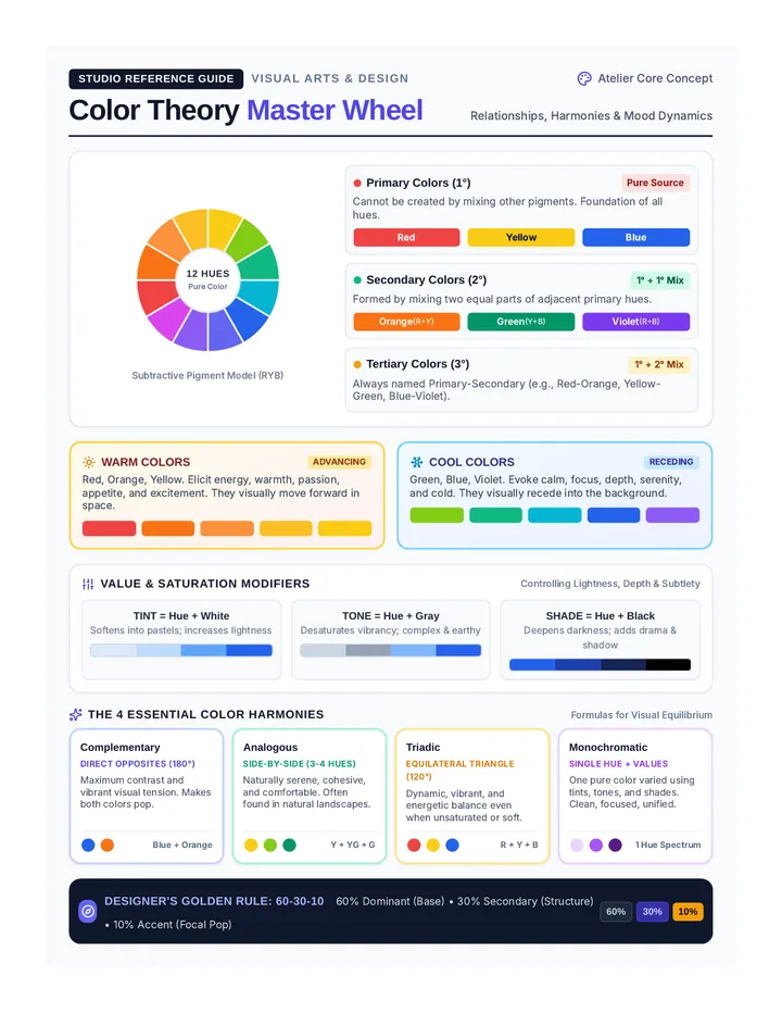
Color Theory Master Wheel
Relationships, Harmonies & Mood Dynamics
12 Hues Pure Color
Subtractive Pigment Model (RYB)
Primary Colors (1°) Pure Source
Cannot be created by mixing other pigments. Foundation of all hues.
Red Yellow Blue
Secondary Colors (2°) 1° + 1° Mix
Formed by mixing two equal parts of adjacent primary hues.
Orange (R+Y) Green (Y+B) Violet (R+B)
Tertiary Colors (3°) 1° + 2° Mix
Always named Primary-Secondary (e.g., Red-Orange, Yellow-Green, Blue-Violet).
Warm Colors
Advancing
Red, Orange, Yellow. Elicit energy, warmth, passion, appetite, and excitement. They visually move forward in space.
Cool Colors
Receding
Green, Blue, Violet. Evoke calm, focus, depth, serenity, and cold. They visually recede into the background.
Value & Saturation Modifiers
Controlling Lightness, Depth & Subtlety
TINT = Hue + White
Softens into pastels; increases lightness
TONE = Hue + Gray
Desaturates vibrancy; complex & earthy
SHADE = Hue + Black
Deepens darkness; adds drama & shadow
The 4 Essential Color Harmonies
Formulas for Visual Equilibrium
Complementary
Direct Opposites (180°)
Maximum contrast and vibrant visual tension. Makes both colors pop.
Blue + Orange
Analogous
Side-by-Side (3-4 Hues)
Naturally serene, cohesive, and comfortable. Often found in natural landscapes.
Y + YG + G
Triadic
Equilateral Triangle (120°)
Dynamic, vibrant, and energetic balance even when unsaturated or soft.
R + Y + B
Monochromatic
Single Hue + Values
One pure color varied using tints, tones, and shades. Clean, focused, unified.
1 Hue Spectrum
Designer's Golden Rule: 60-30-10 60% Dominant (Base) • 30% Secondary (Structure) • 10% Accent (Focal Pop)
60% 30% 10%
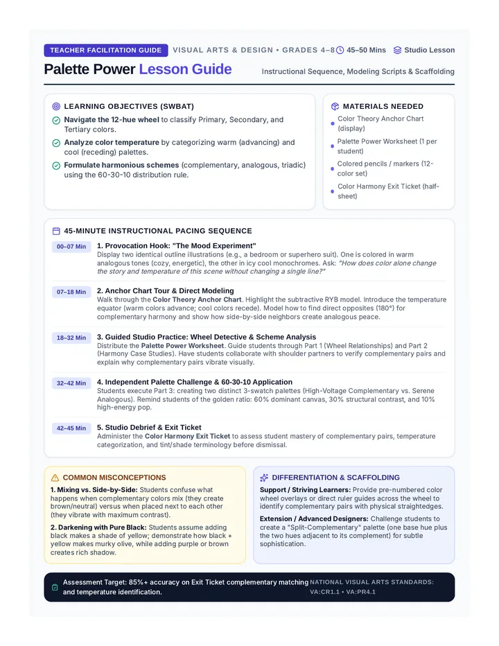
Palette Power Teacher Guide Teacher Facilitation Guide Visual Arts & Design • Grades 4–8
45–50 Mins Studio Lesson
Palette Power Lesson Guide
Instructional Sequence, Modeling Scripts & Scaffolding
Learning Objectives (SWBAT)
Navigate the 12-hue wheel to classify Primary, Secondary, and Tertiary colors.Analyze color temperature by categorizing warm (advancing) and cool (receding) palettes.Formulate harmonious schemes (complementary, analogous, triadic) using the 60-30-10 distribution rule.
Materials Needed
Color Theory Anchor Chart (display)
Palette Power Worksheet (1 per student)
Colored pencils / markers (12-color set)
Color Harmony Exit Ticket (half-sheet)
45-Minute Instructional Pacing Sequence
00–07 Min
1. Provocation Hook: "The Mood Experiment"
Display two identical outline illustrations (e.g., a bedroom or superhero suit). One is colored in warm analogous tones (cozy, energetic), the other in icy cool monochromes. Ask: "How does color alone change the story and temperature of this scene without changing a single line?"
07–18 Min
2. Anchor Chart Tour & Direct Modeling
Walk through the Color Theory Anchor Chart . Highlight the subtractive RYB model. Introduce the temperature equator (warm colors advance; cool colors recede). Model how to find direct opposites (180°) for complementary harmony and show how side-by-side neighbors create analogous peace.
18–32 Min
3. Guided Studio Practice: Wheel Detective & Scheme Analysis
Distribute the Palette Power Worksheet . Guide students through Part 1 (Wheel Relationships) and Part 2 (Harmony Case Studies). Have students collaborate with shoulder partners to verify complementary pairs and explain why complementary pairs vibrate visually.
32–42 Min
4. Independent Palette Challenge & 60-30-10 Application
Students execute Part 3: creating two distinct 3-swatch palettes (High-Voltage Complementary vs. Serene Analogous). Remind students of the golden ratio: 60% dominant canvas, 30% structural contrast, and 10% high-energy pop.
42–45 Min
5. Studio Debrief & Exit Ticket
Administer the Color Harmony Exit Ticket to assess student mastery of complementary pairs, temperature categorization, and tint/shade terminology before dismissal.
Common Misconceptions
1. Mixing vs. Side-by-Side: Students confuse what happens when complementary colors mix (they create brown/neutral) versus when placed next to each other (they vibrate with maximum contrast).
2. Darkening with Pure Black: Students assume adding black makes a shade of yellow; demonstrate how black + yellow makes murky olive, while adding purple or brown creates rich shadow.
Differentiation & Scaffolding
Support / Striving Learners: Provide pre-numbered color wheel overlays or direct ruler guides across the wheel to identify complementary pairs with physical straightedges.
Extension / Advanced Designers: Challenge students to create a "Split-Complementary" palette (one base hue plus the two hues adjacent to its complement) for subtle sophistication.
Assessment Target: 85%+ accuracy on Exit Ticket complementary matching and temperature identification.
National Visual Arts Standards: VA:Cr1.1 • VA:Pr4.1
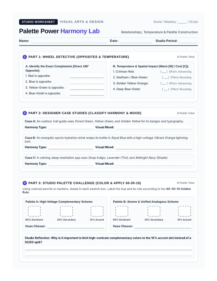
Palette Power Worksheet Studio Worksheet Visual Arts & Design
Score / Mastery: _____ / 20 pts
Palette Power Harmony Lab
Relationships, Temperature & Palette Construction
Name:
Date:
Studio Period:
1 Part 1: Wheel Detective (Opposites & Temperature)
8 Points Total
A. Identify the Exact Complement (Direct 180° Opposite):
1. Red is opposite:
2. Blue is opposite:
3. Yellow-Green is opposite:
4. Blue-Violet is opposite:
B. Temperature & Spatial Impact (Warm [W] / Cool [C]):
1. Crimson Red:
[ ___ ] Effect: Advancing
2. Seafoam / Blue-Green:
[ ___ ] Effect: Receding
3. Golden Yellow-Orange:
[ ___ ] Effect: Advancing
4. Deep Blue-Violet:
[ ___ ] Effect: Receding
2 Part 2: Designer Case Studies (Classify Harmony & Mood)
6 Points Total
Case A: An outdoor trail guide uses Forest Green , Yellow-Green , and Golden Yellow for its badges and typography.
Harmony Type:
Visual Mood:
Case B: An energetic sports hydration drink wraps its bottle in Royal Blue with a high-voltage Vibrant Orange lightning bolt.
Harmony Type:
Visual Mood:
Case C: A calming sleep meditation app uses Deep Indigo , Lavender (Tint) , and Midnight Navy (Shade) .
Harmony Type:
Visual Mood:
3 Part 3: Studio Palette Challenge (Color & Apply 60-30-10)
6 Points Total
Using colored pencils or markers, shade in each swatch box. Label the hue and its role according to the 60-30-10 Golden Rule .
Palette A: High-Voltage Complementary Scheme
60% Dominant
30% Secondary
10% Accent
Hues Chosen:
Palette B: Serene & Unified Analogous Scheme
60% Dominant
30% Secondary
10% Accent
Hues Chosen:
Studio Reflection: Why is it important to limit high-contrast complementary colors to the 10% accent slot instead of a 50/50 split?
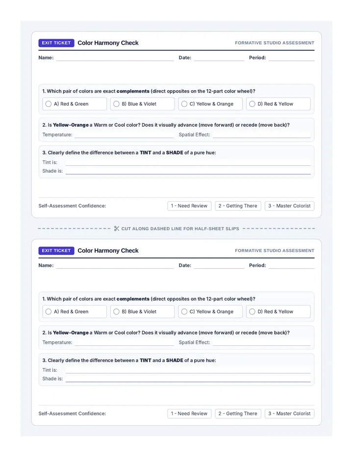
Color Harmony Exit Ticket Exit Ticket
Color Harmony Check
Formative Studio Assessment
Name:
Date:
Period:
1. Which pair of colors are exact complements (direct opposites on the 12-part color wheel)?
A) Red & Green
B) Blue & Violet
C) Yellow & Orange
D) Red & Yellow
2. Is Yellow-Orange a Warm or Cool color? Does it visually advance (move forward) or recede (move back)?
Temperature:
Spatial Effect:
3. Clearly define the difference between a TINT and a SHADE of a pure hue:
Tint is:
Shade is:
Self-Assessment Confidence:
1 - Need Review 2 - Getting There 3 - Master Colorist
Cut Along Dashed Line for Half-Sheet Slips
Exit Ticket
Color Harmony Check
Formative Studio Assessment
Name:
Date:
Period:
1. Which pair of colors are exact complements (direct opposites on the 12-part color wheel)?
A) Red & Green
B) Blue & Violet
C) Yellow & Orange
D) Red & Yellow
2. Is Yellow-Orange a Warm or Cool color? Does it visually advance (move forward) or recede (move back)?
Temperature:
Spatial Effect:
3. Clearly define the difference between a TINT and a SHADE of a pure hue:
Tint is:
Shade is:
Self-Assessment Confidence:
1 - Need Review 2 - Getting There 3 - Master Colorist