Graph Anatomy Slides Graph Anatomy
Conventions and Standards of Single-Subject Line Graphs in Applied Behavior Analysis
Behavioral Data Series
The Visual Standard
In behavior analysis, the graph is our primary tool for Visual Inspection.
Immediate access to data patterns.
Identification of trends over time.
Standardized communication between clinicians.
Clear data drives better clinical decisions.
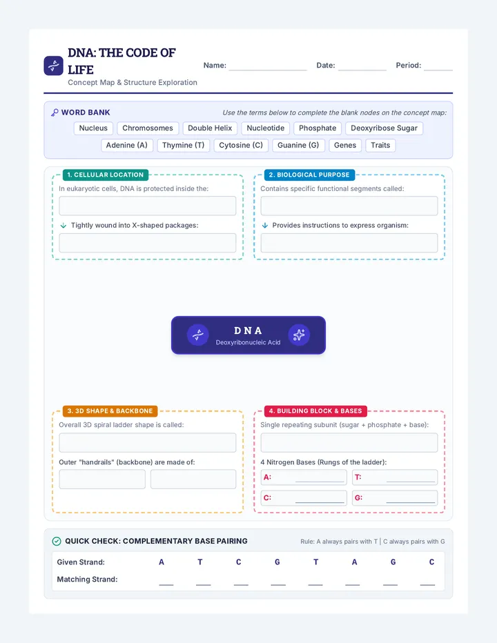
The 6 Vital Organs
01
The X-Axis
The Abscissa. Represents time (days, sessions, weeks).
02
The Y-Axis
The Ordinate. Represents the target behavior (frequency, rate, duration).
03
Condition Labels
Names of the phases (e.g., "Baseline", "FCT Intervention").
04
Phase Lines
Vertical lines indicating when an intervention change occurred.
05
Data Path
The series of connected data points (The "Line").
06
Legend/Key
Explains different symbols if multiple behaviors are plotted.
The Golden Ratio: 2:3
"The Y-axis should be approximately 2/3 the length of the X-axis."
Standard View
Distorted View
Prevents visual exaggeration of data trends.
Avoid These "Graphing Sins"
Connecting Dots Across Phases
NEVER draw a line through a vertical phase change line. Each phase is a separate data path.
Missing Origin
The intersection of the X and Y axes should always be zero.
Cluttered Grids
Keep the background clean. Avoid excessive horizontal or vertical grid lines that distract from the data.
Vague Axes Labels
Labels like "Results" or "Time" are too vague. Be specific: "Rate of Hitting" or "10-Minute Sessions".
Graph Autopsy Worksheet Graph Autopsy
Behavioral Data Series: Lesson 1
Name:
Date:
01
The Component Checklist
Identify the missing or incorrect components in the diagram below. Using the provided list, label each part of the single-subject graph by drawing a line to the corresponding area.
Label A
Label B
Label C
Label D
Abscissa (X)
Ordinate (Y)
Condition Labels
Phase Line
02
The "Bad Data" Investigation
Examine the graph below. Identify three critical violations of ABA graphing standards and explain why they are problematic for clinical decision-making.
Monday - Friday - Sunday - Next Month - Forever
GRAPH TITLE: SUCCESS RATES
Violation 1:
Violation 2:
Violation 3:
03
Proportionality Calculation
If your X-axis (time) is 15 centimeters long, how long should your Y-axis (behavior) be to satisfy the "2/3 Rule"? Show your work.
ABA Graphing Standards Guide Teacher Resource
ABA Graphing Standards
Master Reference Guide for Instruction & Assessment
Lesson 1: Anatomy & Conventions
Critical Terminology
Abscissa (X-Axis): Must denote passage of time. Scale must be continuous and linear. Common units: sessions, days, weeks.
Ordinate (Y-Axis): Must denote the dimension of behavior. Common units: count, rate, duration, latency, or percent of opportunities.
Origin: The (0,0) point. Both axes must start at zero unless a scale break is clinically justified (rare in baseline).
Condition Labels: Centered at the top of the condition space. Use simple, descriptive terms (e.g., "Baseline", "DRA + Extinction").
Technical Standards
The 2/3 Rule
"The Y-axis is 5/8 to 3/4 (approx. 2/3) the length of the X-axis."
Data Points
Points should be clearly visible but not larger than the scale increments. Use solid circles for the primary path.
Phase Change Lines
Solid vertical lines between major conditions. Dashed lines for minor modifications (e.g., changing a reinforcement schedule).
Instructional Nuances
Misconception Alert
Students often want to connect data points across phase changes. Emphasize that a phase line represents a "break" in the environment; thus, the data path must also break.
Aesthetic Clarity
ABA graphs prioritize data over design. Discourage the use of colors, shadows, or 3D effects. The goal is "unambiguous visual inspection."
Axis Scaling
Teach students to look at the range of the data before setting the Y-axis. If the max data point is 10, the axis shouldn't go to 100.
Quick-Check Assessment Rubric
Criterion Exceptional (3) Adequate (2) Needs Revision (1) Labeling All axes and phases precisely labeled with units. Most labels present; minor ambiguity. Missing or incorrect axis labels. Paths No lines across phase breaks; clear data points. Paths correct but visual clarity is low. Dots connected across phase lines. Ratio Follows 2/3 ratio perfectly. Slightly tall or wide but readable. Severely distorted (e.g., extremely tall).
Plotting and Phases Slides Plotting & Phases
From Raw Data to Clinical Insights: The Mechanics of Graph Construction
Lesson 2: Workshop
The Plotting Workflow
1
Clean
Review raw data sheets for errors or missing entries.
2
Scale
Determine the range for X and Y axes based on the dataset.
3
Plot
Place data points accurately and connect within phases.
4
Phase
Insert vertical lines where intervention changed.
Phase Changes: The Break
Phase changes are the most important visual markers in single-subject design. They represent environmental manipulation.
Baseline to Treatment
Modification of Treatment (DRA to DRO)
Addition of Medication
Baseline
Intervention
Solid Line = Major Change
The "Rules" of the Line
No Connection
Points are never connected across phase lines. This visually separates the data universes.
Missing Data
If a session is missed, leave a gap in the line. Do not connect points separated by an unrecorded time period.
Visualizing Gaps & Phases
Efficiency vs. Mastery
In this workshop, we will start with manual graphing to understand the "gravity" of each point, before moving to spreadsheet software.
Manual Mastery
Teaches precision and spatial awareness.
Digital Speed
Necessary for large-scale clinical practice.
Data Construction Activity The Data Bridge
Activity: Converting Raw Tallies to Visual Patterns
Name:
UNIT 2.2
Clinical Scenario
Client: Leo (Age 7).Target Behavior: Out-of-seat behavior during 30-minute circle time sessions.Intervention: Visual schedule and token economy introduced starting in Session 6.
Raw Frequency Data
Session # Phase Count 1 Baseline 12 2 Baseline 14 3 Baseline 13 4 Baseline 15 5 Baseline 12 6 Token Intervention 8 7 Token Intervention 6 8 Token Intervention 5 9 Token Intervention 3 10 Token Intervention 2
Your Task
Define Scale: Determine the max value for your Y-axis (consider the highest data point + a buffer).Label Axes: Label the X and Y axes with specific units.Plot Points: Plot the 10 data points on the grid below.Add Phase Line: Insert a solid vertical line between Sessions 5 and 6.Connect Paths: Connect data points within each phase, but DO NOT connect Session 5 to Session 6.Condition Labels: Center labels for "Baseline" and "Token Economy" at the top of their respective spaces.
Behavioral Data Plot
Ordinate Label Here
Abscissa Label Here
Checklist for Mastery
Points precisely placed?
Solid vertical line @ Session 5.5?
No connection across phase?
X-axis sessions labeled 1-10?
"A graph is only as good as the precision of the plotter."
Graphing Construction Rubric Graph Construction Rubric
Standardized Assessment: Lessons 1-2
Total Score
/ 20
TECHNICAL PRECISION & PLOTTING
5 Points Possible
Mastery (5 pts)
All 10 data points are precisely placed. Point size is consistent. Solid lines connect all points within phases.
Developing (3 pts)
1-2 points are misaligned with axis increments. Point size varies slightly.
Emerging (1 pt)
Frequent plotting errors. Points are messy or illegible. Path lines are shaky.
PHASE CHANGE CONVENTIONS
5 Points Possible
Mastery (5 pts)
Solid vertical line correctly placed between Session 5 & 6. NO line connects dots across the phase break.
Developing (3 pts)
Phase line is present but slightly misplaced or drawn as a dashed line (incorrect for major changes).
Emerging (1 pt)
Phase line is missing OR points are connected across the phase break (Critical Error).
SCALING & PROPORTIONALITY
5 Points Possible
Mastery (5 pts)
Graph adheres to the 2/3 ratio. Y-axis is scaled appropriately for the data range (0-16 or 0-20).
Developing (3 pts)
Ratio is slightly distorted. Y-axis scale is inefficient (e.g., goes to 100 for data max of 15).
Emerging (1 pt)
No coherent scale on Y-axis. Graph is severely tall or wide.
CLARITY & LABELING
5 Points Possible
Mastery (5 pts)
Both axes specific and labeled. Condition labels ("Baseline", "Intervention") centered and clear.
Developing (3 pts)
Labels are present but vague (e.g., "Time" instead of "Session #"). Condition labels off-center.
Emerging (1 pt)
Missing axis labels. Missing condition labels. Unprofessional handwriting/presentation.
Instructor Feedback / Observational Notes Trend Analysis Slides The Big Three
Mastering Visual Analysis: Level, Trend, and Variability
Lesson 3: Analysis Concepts
Beyond "It looks better"
Behavior analysts don't use statistical significance tests for daily decisions. We use Visual Analysis.
"Visual analysis is the systematic process for examining and interpreting behavioral data."
Our Questions:
Where is the data now?
Where is it going?
How much does it jump?
01. Level
The value on the vertical axis around which a series of behavioral measures converge.
Analysis Tip:
Look for the "mean level" (average) or "median level." Is the level High, Moderate, or Low relative to clinical goals?
Avg
The "Baseline Level" sets our comparison point.
02. Trend
The overall direction taken by a data path.
Ascending (Increasing)
Descending (Decreasing)
Zero Trend (Stable)
Ascending
Descending
03. Variability
The frequency and degree to which multiple measures of behavior yield different outcomes.
High Variability = Unstable
Unstable data suggests environmental variables are out of control. We cannot predict the next point.
High Variability
Stable
Reading the Lines Worksheet Reading the Lines
Visual Analysis Workshop: Level, Trend, & Variability
Analyst:
UNIT 3.1
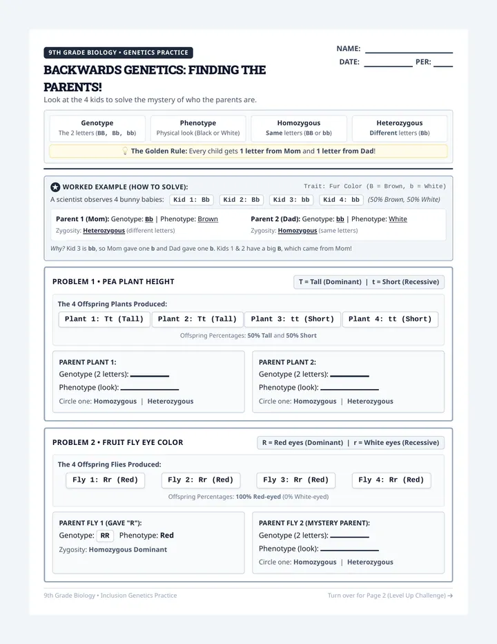
Instructions: For each graph below, describe the data path using the professional terminology for Level (Low/Med/High), Trend (Ascending/Descending/Zero), and Variability (Stable/Unstable).
Graph A
Mean Level
Trend
Variability
Clinical Narrative (1 Sentence):
Graph B
Mean Level
Trend
Variability
Clinical Narrative (1 Sentence):
Graph C
Mean Level
Trend
Variability
Clinical Narrative (1 Sentence):
Critical Synthesis
In which of the three graphs above (A, B, or C) would it be most difficult to predict the next data point? Explain why using the term Variability.
Intervention Impact Slides The Verdict
Evaluating Intervention Efficacy through Visual Evidence
Lesson 4: Interpretation
Markers of Effectiveness
Immediacy
How quickly did the behavior change once the phase line was crossed?
Non-Overlap
How many data points in treatment fell outside the range of baseline?
Consistency
Is the change sustained over time, or was it a "honeymoon effect"?
Immediacy
The change in level between the last point of baseline and the first point of intervention.
"An immediate change suggests a strong functional relation between the environment and the behavior."
Visualizing the "Jump"
The Problem with Overlap
If data points in treatment are the same value as points in baseline, we cannot be sure the intervention caused the change.
"High overlap = Low clinical confidence."
Overlap Zone
Minimal overlap is the gold standard.
Math meets Vision
PND (Percent of Non-overlapping Data) allows us to quantify what our eyes see.
The Formula
\[ \frac{\text{# points in treatment above BL max}}{\text{Total points in treatment}} \times 100 \]
Case Study Jury Worksheet Case Study Jury
Clinical Evaluation: The Verdict on Treatment Efficacy
Clinician:
Phase 4.2
Instructions: You are the Lead Clinician. Review the two cases below. Use your skills in visual analysis to determine if the intervention is effective. Calculate PND where requested and provide your clinical recommendation.
Case #001: Reading Fluency (Target: Increasing)
Intervention: Repeated Reading Strategy
Max BL Point
42
WCPM (Words Correct Per Minute)
Immediacy of Effect
Abrupt Jump? Yes / No
Trend Change
Stable to Ascending?
PND Calculation Area (Show work):
The Verdict: Continue Treatment?
Case #002: Elopement (Target: Decreasing)
Intervention: Function-Based Proximity Control
Min BL Point
3
Instances of Elopement
Immediacy of Effect
Abrupt Jump? Yes / No
Overlap Assessment
High / Low Overlap?
Observations on Variability:
The Verdict: Modify or Maintain Treatment?
PND Calculation Guide PND Calculation Guide
Quantifying Visual Non-Overlap in Single-Subject Research
STEP 1
Identify the "Extreme" Baseline Point
Determine the Highest data point in Baseline (if behavior is meant to increase) OR the Lowest data point in Baseline (if behavior is meant to decrease).
"Draw a horizontal line across the entire graph starting at this point."
STEP 2
Count the Non-Overlapping Points
In the Intervention Phase, count how many data points are "cleanly" above or below that horizontal line.
Note: If a point touches the line exactly, it counts as OVERLAP (do not count it).
STEP 3
Apply the Calculation
\[ \text{PND} = \left( \frac{\text{# Non-Overlapping Tx Points}}{\text{Total # of Tx Points}} \right) \times 100 \]
Interpreting the Score (Scruggs & Mastropieri)
PND Score (%) Clinical Interpretation 90% + Very Effective Intervention 70% to 90% Effective Intervention 50% to 70% Questionable Effectiveness Below 50% Ineffective Intervention
Data Narrative Slides Beyond the Lines
Translating Visual Data into Professional Narratives for Stakeholders
Lesson 5: Reporting
Precision in Prose
Our goal is to describe the behavioral facts without adding personal bias, emotive language, or unverified assumptions.
Emotive (Avoid)
"Leo had a really bad week and was acting out a lot because he was frustrated with the tokens."
Objective (Aim)
"Data indicate an ascending trend in out-of-seat behavior during the second week of the Token Intervention phase."
The 3-Part Report
1. Context
Identify the behavior, the time period, and the current intervention phase.
2. Visual Findings
Explicitly state the Level, Trend, and Variability seen in the data path.
3. Decision
State the clinical outcome: Continue, Modify, or Fade the intervention.
Making Strong Claims
Claim
"The intervention is working."
Evidence
"Intervention data shows a PND of 100% and an immediate change in level from a baseline mean of 15 to a treatment mean of 4."
Transparency = Trust
Graphs are powerful communication tools for parents. They replace "I feel" with "We see."
"In today's simulation, you will practice delivering difficult news by leaning on the visual evidence."
Progress Memo Simulation The Progress Memo
Stakeholder Simulation: Clinical Writing Lab
The Simulation Scenario
You are the Behavior Analyst for Maya , a 10-year-old student working on Social Initiative (starting conversations with peers). After 4 weeks of a Social Prompting intervention, the data shows high variability and a descending trend (meaning Maya is initiating less, and the data is all over the place).
Session Range: 1-20 Phase: Prompting vs. Baseline Finding: Counter-Therapeutic
Task: Internal Clinical Memo
Write a technical data narrative for the school's IEP team. Use specific vocabulary (Level, Trend, Variability) to explain why the intervention should be modified.
To:
IEP Team / Clinical Supervisor
Subject:
Data Summary: Maya (Social Initiative)
1. Objective Findings (Level, Trend, Variability):
2. Clinical Recommendation & Rationale:
Task: The Parent Update
Now, rewrite the key findings for Maya's parents. Maintain objectivity but focus on clarity and next steps. Avoid technical jargon like "ordinate" or "abscissa," but keep the core data findings.
Update Draft:
Professional Tone Cheat Sheet Objective Tone Guide
Behavioral Documentation Reference
Unit 5: Data Narratives
The "Forbidden" Phrases
Emotive or subjective language can bias clinical decisions and misinform stakeholders.
Instead of:
"He felt much better today."
Use:
"Data show a 40% decrease in tantrum frequency from the previous session."
Instead of:
"The student was lazy and didn't want to work."
Use:
"Compliance with demands remained at a low level (mean = 10%) during the morning session."
Instead of:
"I think the plan is working great!"
Use:
"A stable descending trend indicates the intervention is having the intended effect on aggression."
The Data Narrative Lexicon
Verbs for Change
Accelerated
Converged
Decelerated
Fluctuated
Stabilized
Surpassed
Qualifiers for Level
Therapeutic
Variable
Counter-therapeutic
Latent
Axiom of Writing
"If you cannot point to a data point on the graph to support your sentence, delete the sentence."