Ink of Justice Teacher Guide Ink of Justice
Teacher Guide
Subject: High School Visual Arts
Unit: Printmaking & Advocacy
Duration: 10-12 Class Periods
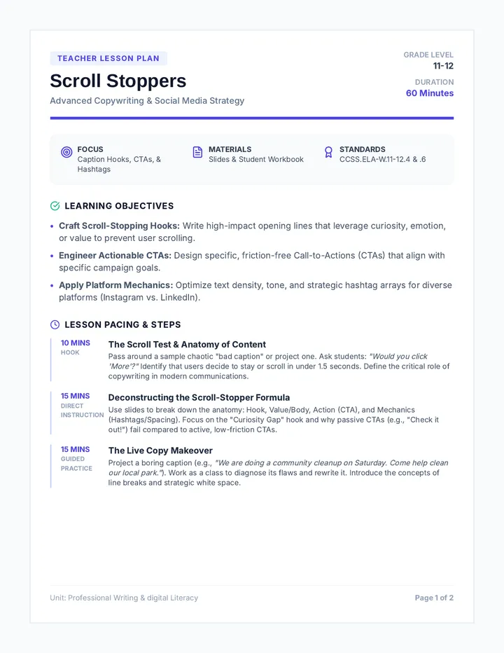
Lesson Summary
Students will explore the history of "Art as Action" by creating a linocut relief print focused on a contemporary social justice or civil rights issue. The lesson emphasizes the technical challenges of typography in printmaking, the strategic use of composition to create impact, and the craftsmanship required for safe and effective carving.
Key Focus Areas
Typography: Legibility, hierarchy, and the "mirror image" carving requirement.
Composition: Balancing positive/negative space and visual weight.
Advocacy: Translating complex social issues into simple, powerful visual messages.
Craftsmanship: Technical carving skills and consistent ink application.
Materials List
6" x 8" Linoleum Blocks (or soft-cut)
Linoleum cutters with various blades
Water-based relief printing ink
Brayers & Inking plates (glass/plexiglass)
Baren or printing press
High-quality printmaking paper
Tracing paper & Graphite pencils
Instructional Phases
1
Context & Ideation (1-2 Days)
Introduce the power of the printed image. Discuss artists like Emory Douglas (Black Panther Party), Taller de Gráfica Popular, and contemporary street artists.
Discussion Prompt: "Why is printmaking traditionally the medium of choice for social movements? How does 'multiplicity' change the value and reach of an artwork?"
2
Design & Typography (2 Days)
Students brainstorm their cause and draft three words minimum. Focus on Visual Hierarchy : making the most important word the biggest or boldest.
CRITICAL STEP: Students must transfer their final sketch to the block in REVERSE. Demonstrate tracing paper transfer methods.
3
The Carve (3-4 Days)
Demonstrate carving techniques. Explain the difference between V-gouges (fine lines) and U-gouges (removing large areas). Emphasize safety protocols.
Check for: Consistent depth. Shallow cuts may fill with ink; too deep might weaken the block.
Check for: Texturing the negative space. Marks left by the gouge can add energy and movement.
4
Printing & Editioning (2-3 Days)
Demonstrate ink charging on the brayer (look for the orange-peel texture/velvety sound). Students pull a "proof" (test print), refine carving if needed, then print a small edition of 3-5 consistent prints.
National Core Art Standards
VA:Cr1.1.IIIa: Visualize and hypothesize to generate plans for ideas and directions for creating art.
VA:Cr2.1.HSII: Through experimentation, practice, and persistence, demonstrate acquisition of skills and knowledge in a chosen medium.
VA:Cn11.1.HSI: Describe how knowledge of culture and history can inform art-making.
Differentiated Support
For Beginners: Use "Soft-Kut" rubber blocks which are significantly easier to carve than traditional linoleum. Provide pre-designed font templates.
For Advanced: Encourage multi-block color printing or reduction printing. Challenge them to incorporate intricate textures rather than solid black/white shapes.
Ink of Justice Blueprint Ink of Justice
Project Blueprint
Name:
Period:
1
The Advocate's Voice
Social Justice Issue / Cause:
The "Motto" (3-5 words that summarize your message):
Why is this issue important to you?
2
Typography & Reversal
Practice your most important word in two different styles. Then, practice writing it backwards in the reversal box.
Style A: Bold Serif
Style B: Modern Sans
REVERSAL (Backwards)
3
Composition Thumbnails
Create two quick layouts. Focus on Visual Hierarchy (which word is biggest?) and Negative Space (where is the ink NOT going?).
Option 1: Symmetrical/Stable
Option 2: Asymmetrical/Dynamic
Ready to Carve? Check your Blueprint:
Do I have at least 3 words?
Is my main word the biggest? (Hierarchy)
Did I reverse my lettering?
Are my lines thick enough to carve?
Ink of Justice Rubric Ink of Justice
Project Rubric
Total Score
____ / 100
Student Name
Period
Criteria Exemplary (25-22) Proficient (21-18) Developing (17-14) Emerging (13-0) Typography
Legibility, Hierarchy, Lettering Style, Reversal
| Text is perfectly reversed; hierarchy is dramatic and clear; lettering is deliberate and adds to the message. | Text is reversed and legible. Hierarchy exists but could be more distinct. Style is consistent. | Some issues with legibility or reversal. Limited hierarchy; letters may be inconsistent in style. | Text is unreadable or not reversed. No attempt at hierarchy. |
|
Composition
Balance, Negative Space, Spacing, Visual Impact
| Masterful use of negative space to create impact. Perfectly balanced layout that guides the eye. | Strong composition with good balance. Negative space is considered and used well. | Layout feels cluttered or uneven. Negative space feels accidental rather than intentional. | Little thought given to layout. Subject is lost or spacing is very awkward. |
|
Craftsmanship
Carving Quality, Ink Consistency, Paper Handling
| Lines are crisp and intentional. Ink is perfectly even; paper is clean with no smudges or fingerprints. | Solid carving technique. Ink is mostly consistent. Print is clean with minimal stray marks. | Carving is "fuzzy" or inconsistent. Ink is too thick (filled details) or too thin (patchy). | Carving is messy/uncontrolled. Inking is poor. Significant smudging or dirty margins. |
|
Advocacy
Message Clarity, Choice of Cause, Originality
| Powerful and original visual message. The chosen cause is clearly and impactfully communicated. | Message is clear and relevant to social justice. Design supports the topic well. | The message is vague or clichéd. Connection to social justice is weak. | Topic is unrelated to the assignment or missing a clear message. |
Teacher Feedback & Notes Ink of Justice Reference Sheet Ink of Justice
Technical Reference: Carvable Characters
Artist Resource
1. Typography for Relief
Not all fonts are created equal in printmaking. Relief printing favors bold weights and thick strokes . Avoid thin lines (hairlines) which may break off or fill with ink.
Best for Carving
SLAB SERIF
Thick rectangular serifs provide structural strength.
GROTESQUE
Uniform stroke width makes for predictable carving.
STENCIL
Breaks in letters add a "protest" aesthetic.
Hard to Carve
Fine Script
Thin connectors will likely break or fill with ink.
Thin Sans
Lack of surface area makes inking difficult.
High Contrast
Transition from thick to thin is technically challenging.
2. Texture & Mark-Making
In linocuts, the "empty" space (negative space) doesn't have to be flat. Use your gouges to create "chatter" or intentional texture.
HATCHING
STIPPLING
ORGANIC
CONTOUR
The Golden Rule of Printmaking
Everything you carve will print in REVERSE . Always check your block in a mirror before you make your first cut. If the text looks backwards in the mirror, it will look forwards in the print!
JUSTICE
Ink of Justice Slides Ink of
Justice
Social Justice Printmaking
Art as Action
Why Printmaking?
/ Multiplicity: One block creates many messages.
/ Democracy: Affordable and accessible for the public.
/ Visual Power: High-contrast imagery grabs attention immediately.
"The artist's role is to raise the consciousness of the people. To make them understand what is happening."
— Emory Douglas, Artist
Typography as Voice
Legibility
If they can't read it, the message is lost. Bold, thick strokes work best for linocuts.
READ ME
Hierarchy
The most important word should be the largest. Guide the viewer's eye.
STOP
The Silence
Reversal
CRITICAL: Your block must be carved in REVERSE . Letters must be backwards.
ABC
ABC
Composition
01
Negative Space
Contrast between ink and paper is what creates impact.
02
Balance
Consider symmetrical vs asymmetrical layouts.
03
Border Control
A strong border frames your message and adds craft.
Composition Grid Diagram
The Craft
Safety First
Carving Safety
Always carve away from your body and your "holding" hand.
Never put your hand in front of the blade.
Keep your gouges sharp; dull blades slip.
Angle your blade correctly for smooth cuts.
Texture & Line
Your carving marks show up in the print! Use different size gouges to create variety in "empty" areas.
Ink Control
Aim for a "velvety" sound when rolling. Too much ink fills in small details.
The Mission
Create a 6x8" linocut that advocates for Social Justice issue you care about.
Requirements
Minimum of 3 words
Clear visual hierarchy
Intentional negative space
High-quality craftsmanship
Equality
Climate
Education
Justice